We pulled this EPIC blog post together to show you how to create a PowerPoint template. Right off the bat, creating a PowerPoint template for your company, or for your team is no small task. There are both a lot of design decisions to make, and a lot of things that need to be properly set up in PowerPoint.
If you stumbled upon this blog post by accident, you might be wondering what a PowerPoint template is, and why do you need one.
In short, a template is a set of pre-built slide layouts and defined formatting to help you quickly create brand consistent and professional PowerPoint presentations.
Below is an example of the properly built template you’ll learn how to create throughout these PowerPoint tutorials.
Time Saving Tip: You can save yourself a bunch of time by first buying a professional PowerPoint template and then tweaking it to meet your needs.
To see the 4 best places I recommend finding professional PowerPoint templates online (and why I like them), read my guide here.
If you and your team make lots of PowerPoint presentations, a properly built template can save you THOUSANDS of hours building and editing your slides (no joke).
On the flip side, if your template is broken (which many are), it can make working in PowerPoint a nightmare.
Chances are that if your current PowerPoint template is difficult to work with, you are using a broken template. This tutorial will help you fix it (fast).
How to create a template in PowerPoint
This is the first of three parts for how to create a PowerPoint template. If you prefer to watch over my shoulder as I do this (and explain it to you), click play below.
If you are more of a reader or want to quickly jump around these different template topics, scroll beneath the video for step-by-step instructions.
Both options will help you achieve the same end results, and that is creating a template for your PowerPoint presentations.
Part #1. Creating Your PowerPoint Template Slide Backgrounds
In the first part of this tutorial, you’ll discover how to create your own slide backgrounds and how to:
- Build the overall frame for your template
- Use and navigate the PowerPoint Slide Master (and how the Parent and Child
- Slides work together)
- Use the different paste special options
- Add a pattern background to your slide
- Crop images to fit your entire slide background
- Add a radial gradient fill to a shape with transparency
- Add new guides and move them around on your Slide Master
- And more!
1. Set the colors for your template
The first step when creating a template in PowerPoint is to select a color scheme for your template (preferably one that reflects your company’s brand image).
To select a color scheme for your template, inside of PowerPoint, navigate to the Design tab, and open the Variant options.
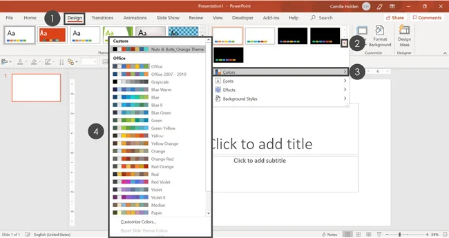
To choose a color scheme for your PowerPoint template, simply:
- Navigate to the Design tab
- Open the More variants options
- Click on Colors to open the dropdown
- Select the color scheme you want to use
If you want to use a color scheme that isn’t listed here, you can create your own.
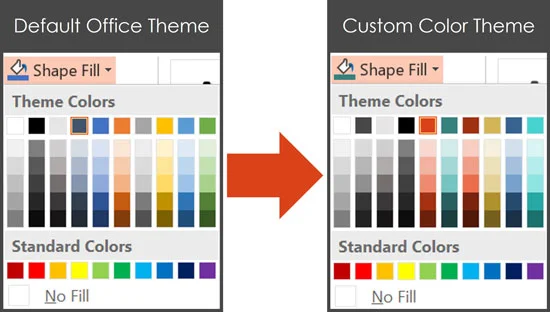
Selecting a new PowerPoint theme changes all the default colors you have to work with inside your presentation (allowing you to maintain consistent formatting throughout).
Your theme colors will be reflected in all of your color dropdowns as pictured below (with pre-populated variants for those colors).
 Note:
Selecting your own custom theme colors does not replace the standard colors at the bottom of your formatting dropdowns. You cannot change these Standard Colors, unfortunately.
Note:
Selecting your own custom theme colors does not replace the standard colors at the bottom of your formatting dropdowns. You cannot change these Standard Colors, unfortunately.
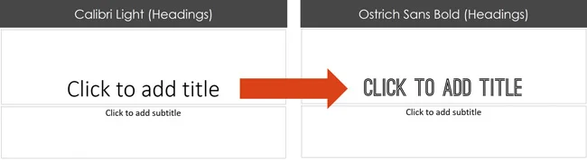
2. Set the fonts for your template
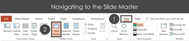
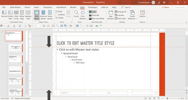
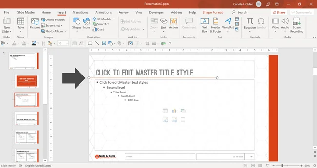
To navigate to your PowerPoint Slide Master, simply:
- Navigate to the View tab
- Select the Slide Master command
The next step is to select a font pairing for your template, which you can also do in the Design tab, under Variants.
NOTE: This is one of my top PowerPoint template tips, and is one you don’t want to mess up. To see my 9 other top tricks for your PowerPoint templates, read my guide here.
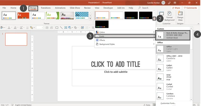 To choose a new font combination for your PowerPoint template, simply:
- Navigate to the Design tab
- Open the More variants options
- Click on Fonts
- Select the font combination you want to use
The ability to make this kind of macro level formatting is one of the major benefits of creating a PowerPoint template. You set your formatting in one place, and it updates throughout your entire presentation (amazing!).
Once you have your colors and fonts selected, you are ready to create the framework. This includes your slide backgrounds and other common design elements you will want in your presentation.
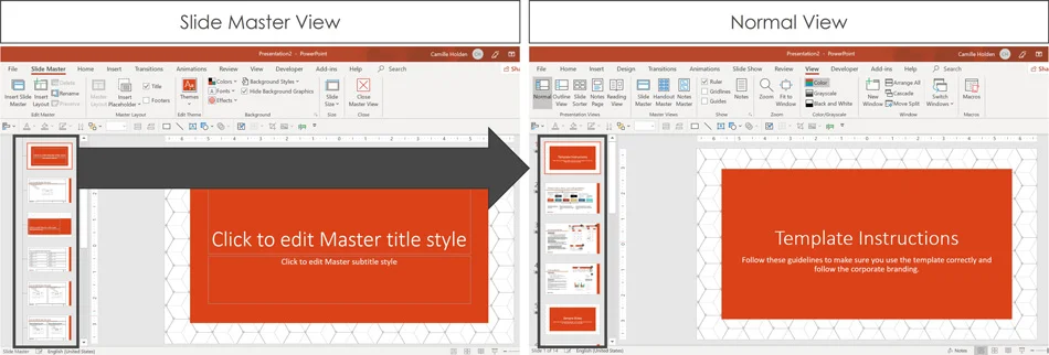
3. Navigate to the Slide Master View
In order to properly create the slide backgrounds for your template, you’ll need to create a presentation framework on the Slide Master.
To choose a new font combination for your PowerPoint template, simply:
- Navigate to the View tab
- Select the Slide Master command
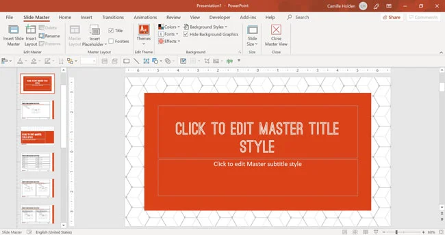
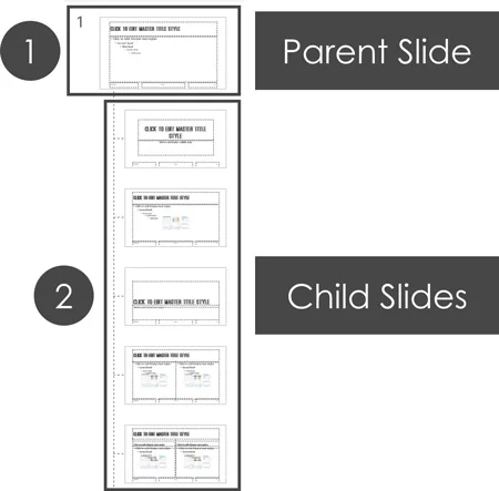
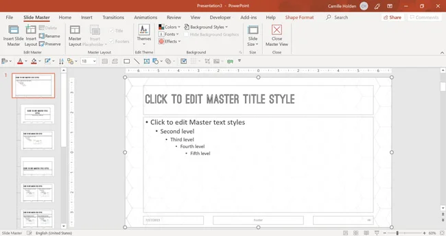
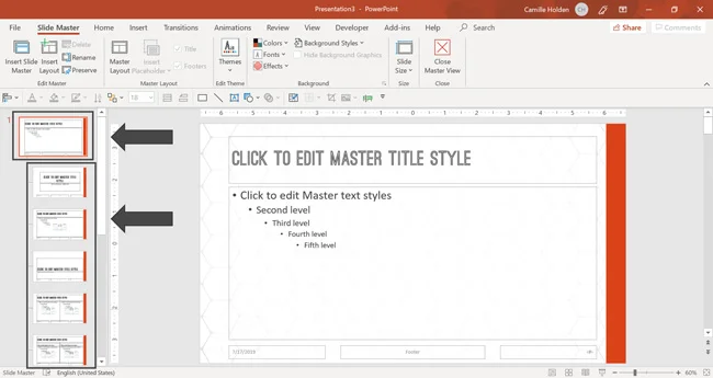
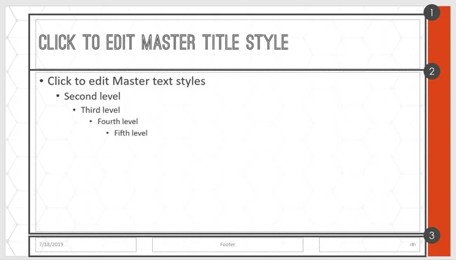
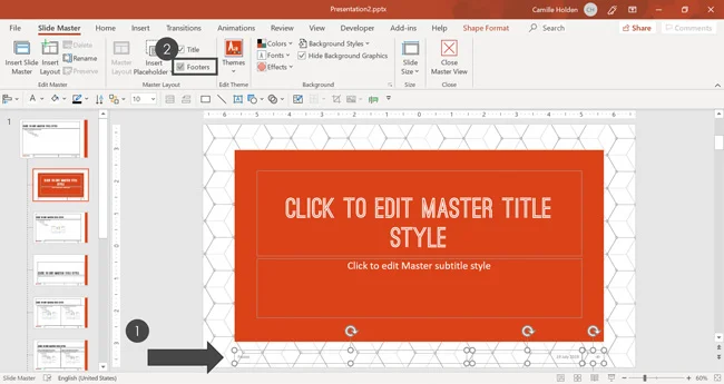
Inside the Slide Master, you’ll see two sets of slides on the left as pictured below:
#1. The Parent Slide (the bigger slide) is where you want to make the macro-level edits that you want to see reflected on the majority of your slides. For example, this is likely where you will want to see things like your company logo or any corporate branding design element.
#2. The Child Slides (the smaller slides) are where you want to customize the individual layouts. For example, your title slides and divider slides may look quite different from the rest of your slides, which is why they’ll have their own Child Slides.
Warning: Although you can delete the Child Slide layouts within a presentation, I don’t recommend it.
As Julie Terberg and Echo Swinford point out in their book on templates, “Building PowerPoint Templates Step by Step with the Experts”, if you delete these Child Slide layouts, you are likely to encounter formatting issues and errors when copying and pasting between your templates down the road.
So unless you are 300% sure you are never going to use these layouts (and nobody on the planet is ever going to send you a slide deck with one of these layouts), I don’t recommend deleting them.
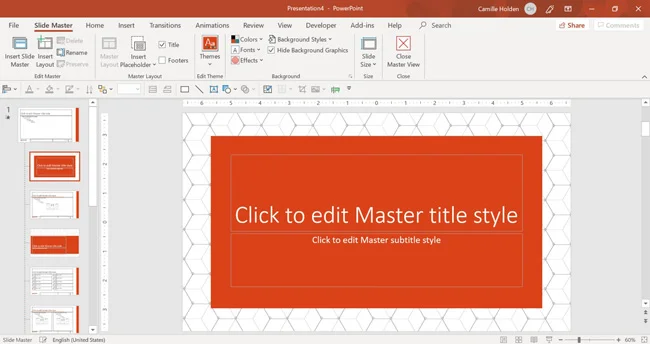
4. Customize your Parent Slide background
Now that you are on your Slide Master, you’ll want to start by formatting your Parent Slide.
That’s because the formatting that you set on your Parent Slide will affect all of the other slide backgrounds within your template.
A. Choose your PowerPoint template's background
Next, you are going to format your slide background with the various design elements you want for all your slides.
In the example below, I’ve chosen a pattern for my template that is minimalist and modern. You can download and insert any picture or pattern you want to use as your slide background image.
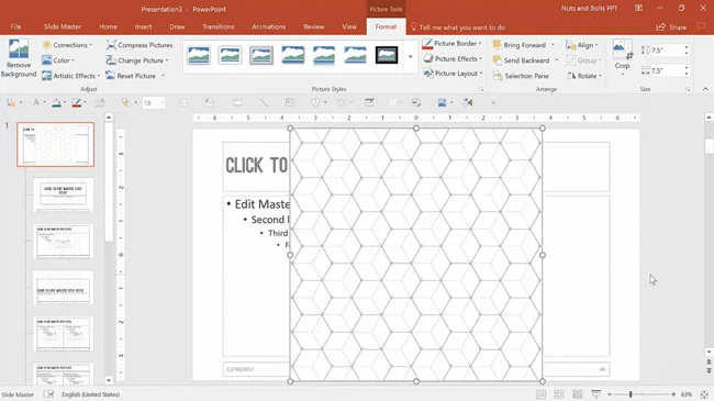
B. Crop to Aspect Ratio
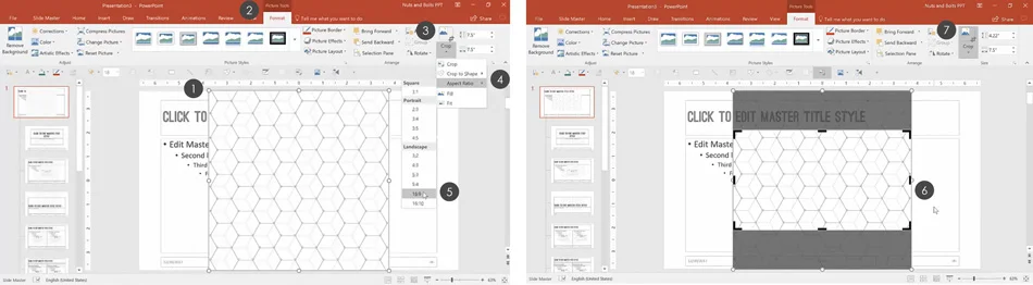
If you are using a picture for your slide background, the fastest way to make it fit on your slide is to crop it using the Aspect Ratio Crop tool. To do that, simply:
- Select the background image you have pasted on the slide
- Navigate to the Format tab
- Open the Crop dropdown
- Open the Aspect Ratio options
- Choose your aspect ratio. In the picture above I chose 16:9 for widescreen to match my slide dimensions (another common aspect ratio is 4:3 for printed slides).
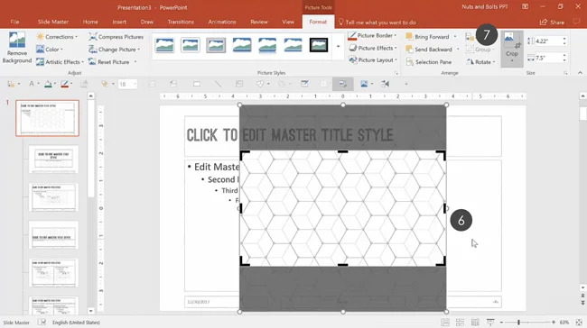
- Adjust your photo within the frame
- Hit the Crop command again or hit Esc on your keyboard
This makes resizing the image to fit your template easier without having to worry about any warping.
Picture Cropping: Want to expand your knowledge and learn more about how to crop pictures in PowerPoint? Read our cropping guide here
C. Fill out your slide background
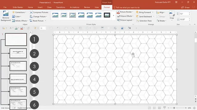
To make the image fit your entire slide space, there are two options.
Option #1. You can simply drag the handlebars to expand the image. Just make sure you hold the Shift key while you enlarge your image, so you don’t accidentally warp it.
Option #2. You can resize your image more precisely:
- In the Shape Width box, enter 13.33 and hit Enter on your keyboard
- Drag the image in the center to fit the entire slide
NOTE: In my example in the video above, I wanted a smaller pattern. That’s why I duplicated the background image so that I have two smaller images next to each other.
And then I made sure to group the two images together so that they function as a unit.
The final example of the background shown below is the result of that. And because the image is set on the Parent Slide like this, by default it will show up as all the slides in my PowerPoint template.
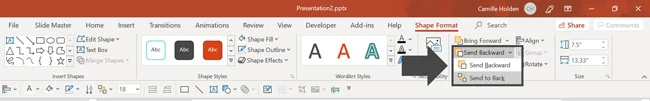
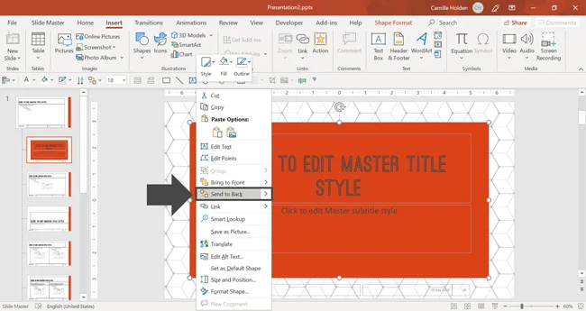
After resizing your background image, you will want to send it back behind all other elements.
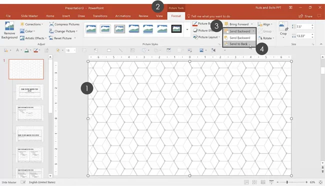
To send the image backward, simply:
- Select your background image
- Navigate to the Picture Tools Format tab
- Click on the Send Backward dropdown
- From the dropdown menu, select Send to Back
This sends the background behind the text as shown in the picture below. This makes all the Parent Slide content placeholders visible again on your slide.

D. Create a semi-transparent gradient layer
With the slide background set for my PowerPoint template, I’m additionally going to make the slide background less visible by adding a semi-transparent layer.
That’s because as you can see in the picture below, the text is not clear against the background image I used. This will make it hard for people to read my slides during a presentation.
In the steps below, I will use the old method (non-Office 365 subscription) for creating a transparent background in PowerPoint. If you have an Office 365 subscription and want to see the brand-new way to create a transparent image, see our guide here.
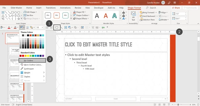
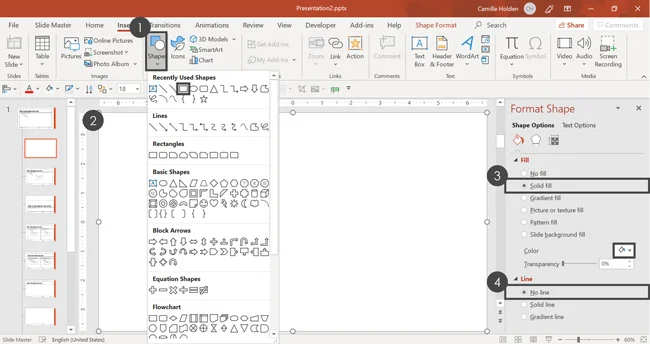
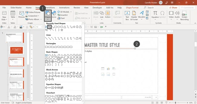
Step #1. Insert and format a rectangle
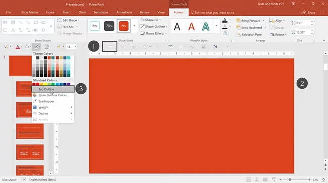
To insert and format a rectangle in PowerPoint, simply:
- From the Insert Tab, click on the Shapes gallery, and select a rectangle (mine is on my QAT).
- Draw in the rectangle so that it covers your entire background image (for this to work, your rectangle needs to be the same exact size as the image you want to make transparent).
- Remove its outline by going to the Shape Outline dropdown and selecting No Outline.
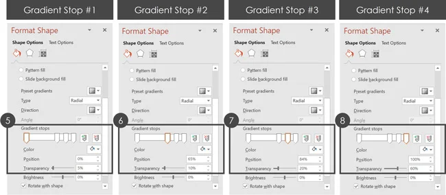
Step #2. Add a gradient fill
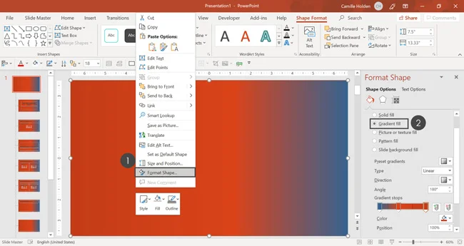
With the rectangle still selected, make the following adjustments:
- Select your rectangle and click Format Shape to open the Format Shape dialog box. This gives you a wide variety of formatting options you can use to format your shape backgrounds for your template.
- Select the Gradient fill.
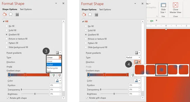
- In the Type dropdown, select Radial.
- For the Direction, select the “from center” option (in the middle).
- In the Gradient stops bar, select the first gradient stop, and from the fill Color dropdown, select white. Under Transparency, enter 5 %. So that it almost looks 100% white in the middle.
- Next, select the second gradient bar and drag it to the right. From the fill Color dropdown, select white. For Transparency, enter 10%.
- Then, select the third gradient bar and drag it to the right. From the fill Color dropdown, select white. For Transparency, enter 10%.
- Finally, select the last gradient bar and drag it to the right. From the fill Color dropdown, select white. For Transparency, enter 60%.
Using the gradient fill options described above, your rectangle should look like mine, with some of your text bleeding through it.
Close the Format Shape pane and you’re all set with your gradient formatting.
As a final step, right-click your gradient rectangle and select Send to Back and then Send Forward so that it sits behind your placeholders but on top of your pattern background.
5. Add a slide background design element
As a next step, I’m going to add a bright bar down the right-side of my slide as a nice design element. To do that, simply:
- Navigate to the Insert tab and select the Shapes dropdown.
- Select a Rectangle and draw it on the right-hand side of your slide. Make sure to place it on the edge of your slide.
- Select No Outline
Note: Make sure you are adding this to your Parent Slide and not a Child Slide. This automatically populates the design element on all the Child Slides.
That’s the power of creating a PowerPoint template – you add a design element in one place, and it shows up throughout your presentation.
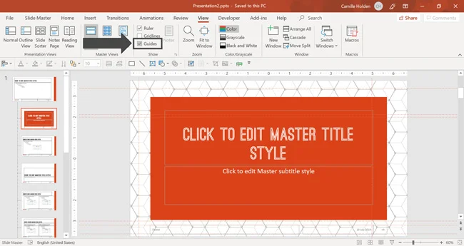
6. Add and edit your guides
In PowerPoint, guides help with formatting, positioning, and slide-to-slide consistency.
Consider guides as the anchors on your slide that help you to consistently align your objects. It’s an optional step, but I recommend adding them to your template.
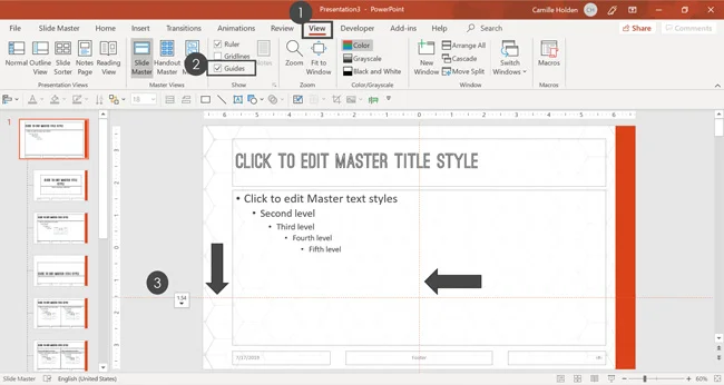
To add guides to your PowerPoint template, simply:
- Click on the View tab
- Select Guides. Notice that there are two guides: one vertical and one horizontal.
- To move a guide, place your mouse over it, and when your cursor becomes a double-headed arrow, drag the guide to where you want it on your slide.
For now, I will simply place my guides on the edges of the slide, to create a “bleed area” in case part of the presentation gets cut off in print.
We will look at adding more guides in part #2 of this series. To add a new guide, simply start dragging an existing one, and then hit the Ctrl key on your keyboard before you let go.
Depending on how you set up your guides, they tell users where they should and shouldn’t be placing content on your slides.
Part #2. Setting up your template placeholders and footers
With your slide background now set up, let’s nail down the following three placeholders on the Parent Slide:
- Title placeholder
- Content placeholder
- Date and time, Footer, and Slide Number placeholders
And even if you don’t want to use these placeholders on all of your slides, it’s still important to set and format them on your Parent Slide.
Why? Because if you don’t, you run the risk of letting default formatting slip through the cracks and ruin an otherwise perfect template.
Later in this tutorial, you’ll learn how to tweak your slide layouts away from the Parent Slide if that’s what you want to do.
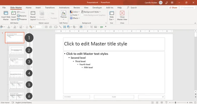
1. Format the Title placeholder
There are a number of ways in which you can format your placeholders and there is no right or wrong formatting.
But before we dive into that, let’s talk about what placeholders are. Placeholders are blank spaces that are designated for certain types of content.
You set these on your Slide Master so that they are locked when people fill them in when building their PowerPoint slides using your template.
Three keys to remember about your content placeholders are:
- They can only be set and edited (for real) on your Slide Master.
- Only text typed into your placeholders will show in the Outline View of your presentation.
- Only text that has been typed into your placeholders will change fonts automatically when you change your theme’s fonts.
You can change the font size, alignment, size, position, etc. of your placeholders to meet your requirements. Below I’ll run you through the most common formatting elements.
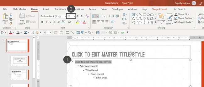
A. Change the font size
Before you start formatting your placeholders, make sure you are on your Parent Slide. We will focus on formatting your Child Slide layouts later.
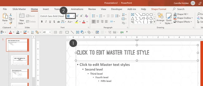
As a first step, let’s change the font size of the title placeholder:
- Select your title placeholder
- In the Font Size dialog box, enter 40 (or whatever size you want)
B. Resize and position the placeholder
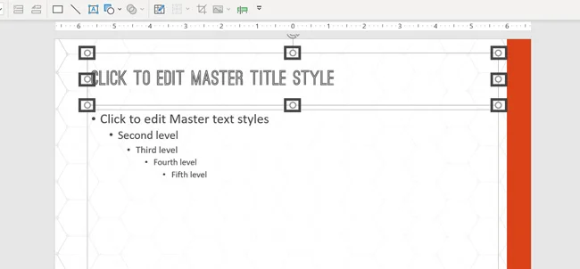
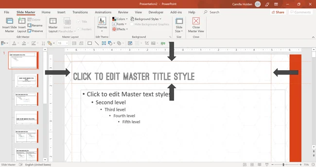
Next, adjust the size and position of your title placeholder. To do that, simply select the placeholder and:
- Use the four-headed arrow cursor to move the placeholder to where you want it on your slide.
- With the placeholder still selected, drag the resizing handles (the 8 little white circles) in or out to resize the placeholder.
There is no right size and position for your title. You’ll simply want to make sure that it fits your slide.
You’ll also want to think about how much text you’re expecting people to type into the placeholder for their slides. Make sure the placeholder is big enough to fit the typical scenario.
C. Set your vertical text alignment
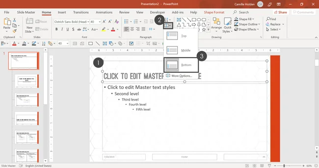
Next, set the vertical text alignment for your title. To do that:
- Select your title placeholder
- From the Home tab, select the Align Text dropdown menu
- Choose your desired vertical text alignment (I’ll choose Bottom for mine)
Unless you have a specific reason to do otherwise, I recommend that you choose Bottom for your vertical text alignment. That way your title text will always stay perfectly aligned at the bottom, from slide to slide.
This helps avoid jumping titles for any slides that have more than one line of text.
On the flip side, if you plan on having short titles for all your slides (no more than one line), I recommend using the Middle text alignment instead.
Regardless of what you decide, make sure you test different title lengths to see what will work best for your PowerPoint template.
D. Align the guides to the title
Since we added our guides in the first part of this series, now we’ll set them to align with our title.
- Drag your Horizontal Guides to match the top and the bottom of your title placeholder (add more guides if necessary)
- Drag your Vertical Guides to match the left-hand and right-hand sides of the title placeholder (add more guides if necessary)
To add a new guide, simply start dragging an existing one, and then hit the Ctrl key on your keyboard before you let go.
Adjusting your guides like this will make aligning objects on your slides much easier as your Smart Guides will automatically snap them together.
Note: If your Guides are not visible, simply right-click on a blank part of your slide and select Grid & Guides, and then Guides. That will turn them on. Alternatively, you can go up to the View tab in the Ribbon and select Guides inside the Show area.
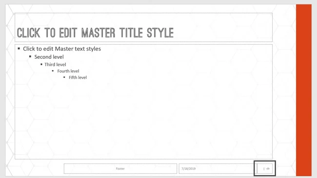
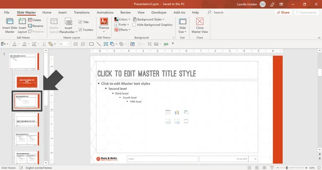
2. Format the Text placeholder
The Text placeholder on your Parent Slide is special in that it will dictate the default formatting of all the other content placeholders in your presentation (except for the Title placeholder and the Footer placeholders).
Setting the default here on the Parent Slide is important because it makes it a lot easier to make fast and consistent changes to swathes of content down the road.
Later in this template series, I will show you how to format away from this default behavior on the Child Slides. But first you want to set its default formatting.
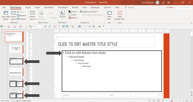
A. Resize and position the Text placeholder
The first thing to do with your Text placeholder is change its position and/or size so that it’s exactly aligned with the Title and Footer placeholders. To do that:
- Select the Text placeholder and when the cursor becomes a four-headed arrow, drag the placeholder to the top and left side so that it is aligned with the Title placeholder.
- With the placeholder still selected, use its sizing handles to adjust its size until it is just right (factoring the amount of text that you predict you’ll type in, as well as the alignment with the other placeholders).
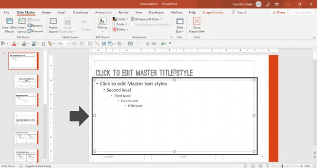
B. Align the guides
In this step, you need to align the horizontal and the vertical guides to that they align with the Text placeholder. To do that:
- Drag the horizontal guides to match the top and the bottom of the Text placeholder.
- Similarly, drag the vertical guides to match the left and right-hand sides of the Text placeholder.
C. Change the font size
The next step is to change the font size of the different levels of text inside the placeholder. To do that:
- Select the first level of text
- In the Font Size box, type in 20 and hit Enter
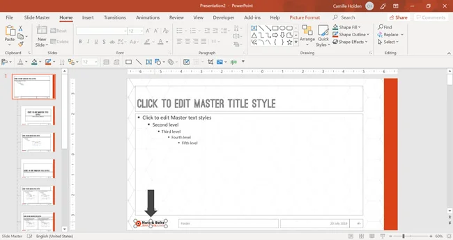
Repeat these steps for the second, third, fourth, and fifth levels of bulleted text, changing their font sizes to 18,16, 14, and 14 respectively.
D. Adjust and align the bullet points
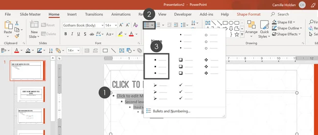
Once you have set the font size, it is important to adjust the bullets.
- Select all the text styles in the content placeholder
- In the Paragraph group, click on the Bullets and Numbering dropdown
- Click on the square style bullets
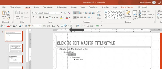
Next, you want to adjust the indent of the bulleted lists so that it appears in all your slide layouts. To do that:
- Select the bulleted list you want to adjust
- Click, hold, and drag the desired indent marker. In our example, we’ll drag the hanging indent marker.
- Repeat this for each text level
You can adjust the bullets as per your personal preference. Based on your knowledge of how someone is going to be using this template, you might decide to add more or less space.
Note: My recommendation as per Julie Terberg and Echo Swinford’s book, “Building PowerPoint Templates Step by Step with the Experts,” is to always make sure that you format every single item you have available. That includes formatting each text list level.
You can see their book on templates here.
That way, you have everything set in case someone decides to break the rules or do their own thing. This inevitably happens with templates and you want to be prepared for it!
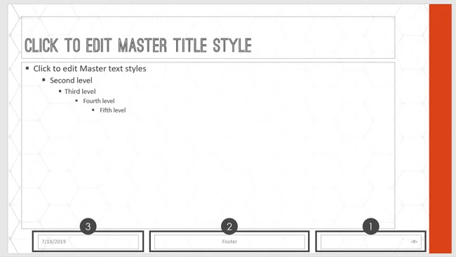
3. Formatting the footers of your template
The footer section of the Slide Master has three types of placeholders:
- Slide number
- Footer text
- Date and time
A. Set the font size for all your footers
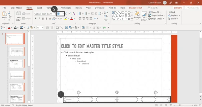
The first step is to change the font size of the footer placeholders. To do that:
- Select all your footer placeholders holding the Shift key.
- In the Font Size dialog box, type 10 (of whatever your desired font size is) and hit Enter.
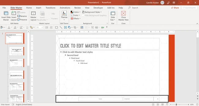
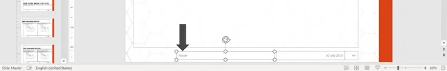
B. Resize and position the placeholders
The next thing to do with the footer placeholders is to change their position and/or size so that they’re aligned with the rest of the placeholders. To do that:
- Select each placeholder and when the cursor becomes a four-headed arrow, drag the placeholder to its desired location (use the guides for assistance).
- With the placeholder still selected, use its sizing handles to adjust its size until it is just right (factoring the amount of text that you predict you’ll type in, as well as the alignment with the other placeholders).
- Repeat this for each placeholder.
If you want to be 100% certain that all the Footer placeholders are the same, select them one at a time and go to the Shape Format tab in the Ribbon. In the Size section, verify that the height of the placeholders is the same.
In this example, note that I am swapping the positions of the Date & Time and Footer placeholders.
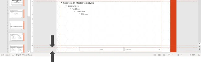
Remember to also add new guides around these placeholders to help keep them in place. Here, I’m only going to add the top and bottom guides, so as to avoid confusion and overkill.
C. Format the Slide Number placeholder
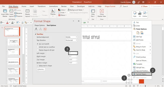
Next, we’ll need to adjust the formatting of the text inside the slide number placeholder. To do that:
- Right-click the placeholder, click on Format Shape and select Text Options
- Open the Text box tab
- Type 0 for the Left margin and hit Tab or Enter on your keyboard
Note: For the slide number placeholder, you can also add symbols as I have here (such as a bar and two spaces), in order to create a visual break from the other placeholders.
D. Format the Date and Time placholder
The next thing is to format the date and time footer placeholder. You can choose any kind of format you like. Below you’ll find the steps that I took in the video tutorial at the top of this page.
First, select the placeholder and hit Ctrl+R on your keyboard to right-align the text to the right (so that it’s flush with the slide number to the right).
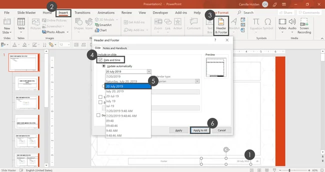
Then, you’ll want to choose what kind of date formatting you want. To do that, simply:
- Select the Date and time placeholder and hit Ctrl + R on your keyboard to align the text to the right.
- Go up to the Insert tab and in the Text group, select Header & Footer.
- Click on Date and time so that there is a checkmark next to it.
- Click on the Date dropdown and select the option as required. In this example, we are going to select December 30th, 2017.
- Click Apply to All to save the changes. You can see that the date and time text has changed accordingly.
E. Format the Footer text placeholder
The final default placeholder to format on the Parent Slide here is the Footer text placeholder. This placeholder is designed for a tagline, an author’s name, or cited sources. For helping citing sources in PowerPoint, read our guide here.
All you need to do here is to select the placeholder and hit Ctrl+L on your keyboard to left-align the text. This way, it is next to the logo and the text inserted will extend out towards the right.
F. (Optional) Add your logo
While all the default placeholders have now been set up and formatted correctly, there is still one element that you can add on the Parent Slide of your Slide Master; and that is a logo.
This is optional, so don’t feel obligated to add one. In fact, a common practice today is to display the logo more sparingly and only place it on certain Child Slide Layouts.
To add a logo, simply:
- Copy the logo and hit Ctrl+V to paste it on the slide. Make sure you paste it as a PNG because it won’t lose its quality over time, whereas a JPEG will.
- Resize and reposition the logo to make it fit nicely in its desired position. Alternatively, you can click on the Picture Format tab in the Ribbon and set the height to 0.35 to make it even with the other placeholders.
You can also use this same technique to add a watermark to your PowerPoint slides. To see how to add a watermark to your slides (like Draft or Confidential), read our guide here.
Part #3. Creating Custom PowerPoint Template Slides
In the last part of this creating a PowerPoint template guide, you’ll finalize the slide layouts that you want to use in your PowerPoint presentation by formatting the Child Slides.
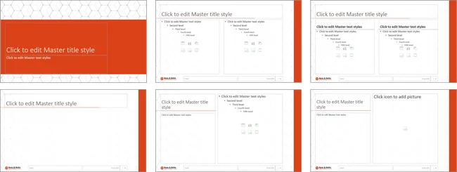
The Child Slides represent the blueprints for each type of slide included in your template. By default, your Child Slide layouts will inherit your Parent Slide formatting. But as you will see, you can tweak these layouts to meet your individual needs.
The key to designing good Child Slide layouts is to keep in mind how the end-user is likely going to insert content on each type of slide. You want to make it easy for everyone to quickly fill them in when using your template.
In this section you’ll learn how to:
- Remove background graphics so that they’re hidden on your Child Slide layouts,
- Make the slide background an existing picture,
- Rename your custom Child Slide,
- Add prompt text to help the template user properly fill in each layout,
- and more!
1. Format the Title slide layout
The first step is to edit the Title slide layout. This layout is designed to be filled in with the title and general information about your presentation.
Typically, its looks slightly different than the rest of the layouts. It usually has less text and fewer images/objects, and it stands apart.
That being said, it still needs to match the other layouts overall and look like it’s a part of the same template.
The first thing we need to do when formatting our Title slide layout is to think about the background. Typically, a Title slide will have a slightly different background from the regular Content slides.
However, because the background has been set on the Parent Slide, this means that you will have to deviate from it. There are 2 ways to approach this – let’s go over each one.
A. Hide the background graphics on a Child Slide - Method #1
The first method for hiding anything in the background (graphics such as the logo, background patterns, design elements, etc.) is to insert a blank rectangle to cover it up.
To cover up your slide background with a white rectangle, simply:
- Go to the Insert tab on the Ribbon, click on the Shapes dropdown, select a rectangle.
- Draw in the rectangle so that it fills out the entire slide.
- Change the rectangle’s fill color to White.
- Remove the rectangle’s outline.
Next, we’ll need to make sure the placeholders are visible on the slide, in front of the newly inserted rectangle.
To do that, with the rectangle still selected, go to the Shape Format tab on the Ribbon, click on the Send Backward dropdown and select Send to Back.
Note: Keep in mind that covering up the background elements like this means that the logo (and any other image you’ve pasted onto the Parent Slide) will be hidden. If you want that element to be visible on this Child Layout, you’ll have to copy/paste it in.
B. Hide the background graphics on a Child Slide - Method #2
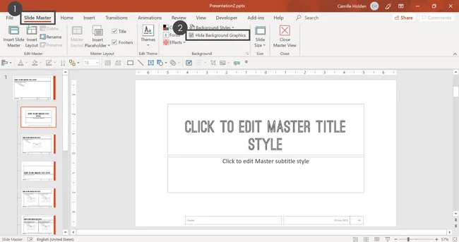
The “technically better” way to do this is to use the default PowerPoint feature set up to do this for you. Simply:
- Go to the Slide Master tab in the Ribbon
- Click on Hide Background Graphics to add a checkmark next to it
This hides anything from the Parent Slide that isn’t a placeholder. This includes any background images or patterns, logos, and other design elements.
You can easily make them visible again by unchecking the Hide Background Graphics checkbox.
C. Add in a new background for this layout
Now that we’ve removed the background inherited from the Parent Slide layout, we’ll need to add in background elements we want on this particular Child Slide.
While the background image can be different, we want to keep it consistent. So let’s go back up and take some elements we can reuse.
First, navigate back to the Parent Slide and select the pattern image (without the gradient). Then hit Ctrl + C on your keyboard to copy it.
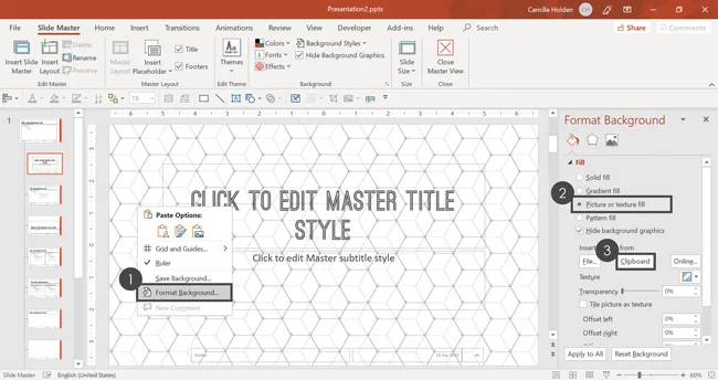
Then, go back to your Title slide layout and:
- Right-click a blank area on your slide and select Format Background.
- In the Format Background tab, select Picture or texture fill.
- Select Clipboard.
This pastes whatever is currently copied on your clipboard into your slide background.
Note: Pasting an object directly into your slide background like this means that it can no longer be edited in your PowerPoint template.
If instead you paste it directly onto the slide as an image, you can always go back in and make adjustments to the image, and therefore to the background too.
It’s up to you whether you want your template’s users to be able to edit the background image or not.
So if you’re putting the image directly into the slide background, I recommended that you only do so when you are sure that this is the final background image you want to use.
D. Add in an extra design element
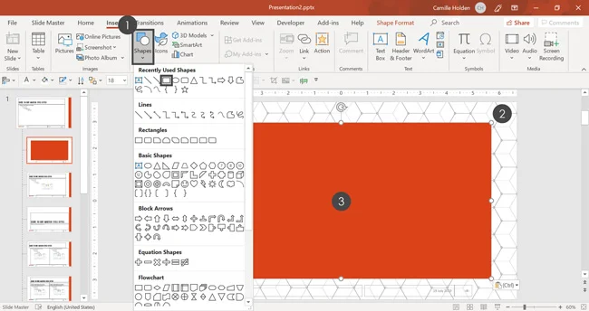
The next step is to add in a design element that matches the general theme and style of the template. To do that:
- Go to the Insert tab on the Ribbon, click on the Shapes dropdown and select a rectangle.
- Draw in the rectangle (it should be filled with the first accent color of your theme) so that it fills about 80% of your slide.
- Make sure the rectangle is centered and in the middle of the slide.
Next, let’s send the rectangle behind the placeholders.
To do that, right-click the rectangle, open the Send Backward dropdown and select Send to Back.
E. Adjust the placeholders
First, adjust your Title and Subtitle placeholders. To do that, simply select the two placeholders and:
- Change their Font color to white.
- Adjust their position and size on the slide, keeping in mind how much room you need to leave for the text.
Next, let’s address the Footer placeholders.
Even if you don’t want footers visible on the Title slide of your template, I don’t recommend deleting them here in the Slide Master View.
Why? Because if someone decides to use them despite your instructions, you still want them to appear correctly and match the rest of the template.
F. Format and hide your Footer placeholders
To format and hide your footer placeholders, simply:
- Format the footer placeholders the way you’d like them to appear if they were used.
- Go up to the Slide Master tab in the Ribbon and deselect the Footers checkbox.
Note: Even if your footers stay selected on this Title slide layout in the Slide Master View, they typically don’t appear on that Title slide in the Normal View.
To turn them on, you have to go to the Insert tab in the Ribbon and select Header & Footer. There, you can turn them on.
So, unless you truly want someone to NEVER be able to add a page number, date and time, and footer text to the Title layout, then I recommend leaving them on the Child Slide, to keep that option open.
If you deselect the Footers checkbox in the Slide Master View as we did above, then when someone tries to insert footers in the Normal View, they will not appear.
To learn all about how to add slide numbers in PowerPoint (and troubleshoot ones that won’t show up), read our guide here.
One more thing you might notice is that the guides are not visible on the Title slide. Since this is a Child Slide, you can’t edit the guides here.
Unfortunately, the guides you set on the Parent Slide will likely not match the content you have on the Title slide (and any Child Slide whose content deviates from it). There is no way around this in PowerPoint at this point in time.
2. Format your Title and Content layout
The next step is to edit the most commonly used PowerPoint slide in any presentation, the Title and Content layout.
This specific slide layout will look almost identical to to the Parent Slide layout that we’ve already set up at this point. This means that there isn’t much we have to do to change it.
However, in this example, we are going to add one more design element to the layout, which is a straight line. To do that simply:
- In the Insert tab on the Ribbon, click on the Shapes dropdown and select the straight line. To make sure it’s 100% straight, hold the Shift key as you draw in the line.
- Drag the straight line and place it underneath the title. It should perfectly fit in thanks to the Smart Guides. Make sure that it’s long enough to go past the text in the Title placeholder.
The reason you don’t add this line to the Parent Slide is that the layout has to be formatted to work for the majority of the layouts in your template.
That means that the Parent Slide has to be relatively bare-bones. You can always add extra elements in the Child Slides.
3. Format the other Child Slides
From here onward, you will need to format each of the Child Slides to match the content that goes in them.
You will want to follow the same procedure as in Step #2 above, keeping in mind what each Child Slide is designed for and how the content should be placed.
Some layouts will require more custom formatting and design elements. For example, for the Divider slide (the first slide in the examples below,) I have added a rectangle that matches the design elements on the Title Slide layout.
4. Optional step: Create your own Child Layouts
In addition to the default Child Slides that PowerPoint gives you, you have the option to create your own.
You can choose to create your own if you have a very specific type of slide that you’ll need to create over and over in your presentation.
If you make the slide under 10 times, it may not be worth clogging up your Slide Master area. But if you use it frequently, creating a layout template for that type of slide will save you countless hours.
Here are the kinds of slides you may want to create a custom layout for:
- Table of Contents / Agenda
- Quote page
- Team bios / Team headshots
- Case studies
- Thank you / Learn more
- About us
- Data dashboard
- and more
Keep in mind that the blank layout (and other blank variations) can always be used to create more one-off slides.
Creating a custom agenda slide
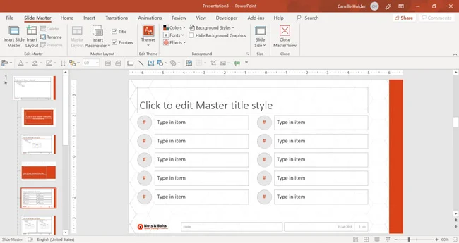
In this example, we’re going to add a custom Agenda Child Slide. To add this custom layout:
- Go to the Slide Master tab in the Ribbon and click Insert Layout. You’ll see that a new Child Slide gets added in with just a Title placeholder and the Footer placeholders.
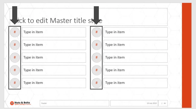
- Add any additional placeholders you need (Slide Master tab > Insert Placeholder) and format them as per your requirements. In this example, I’ve added 20 text placeholders that I’ve resized and formatted.
- Adjust the prompt text in the placeholders to fit the respective content need. For example, in the image below you can write “Type in item” so that the user knows to type in the right text into each placeholder.
Note: You can change the shape of a placeholder, as well as adjust all other properties of a typical shape. That means that you can also add fill, outline, effects, etc.
This is how I was able to create the circular TOC numbers in this layout:
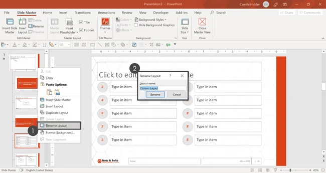
You can also rename the custom Child Layout by:
- Right-clicking it in the Thumbnail View on the left-hand side and selecting Rename Layout.
- Type in a helpful name and click Rename.
Note: You can perform these steps for all custom Child Slides. You can also create custom layouts for a lot of slides such as for products, case studies, contact us, etc.
However, try not to go overboard because you don’t want to have a layout area packed full of slides, which will confuse the user.
But for very frequently occurring slides, I highly recommend making a custom layout.
There are also other slides in the template such as the content slide with subtitles or a blank slide with a title. You can format them per your requirements.
5. Finalize your PowerPoint template
Although your PowerPoint template is almost finished, there are still a few critical steps I recommend taking. Take a deep breath, you are almost there.
A. Set your PowerPoint animations and transitions
The first thing is to set the animations and transitions for your slides. For all placeholders that you want to automatically animate in your template, simply select it and apply your animation.
Note: Keep in mind that animations should be used in your template VERY sparingly. That’s not only because animations can be overly distracting, but it’s also because the user of your template may not want to have animations set automatically for them.
In short, make sure you create the template in a way that makes your users’ life easier, rather than harder.
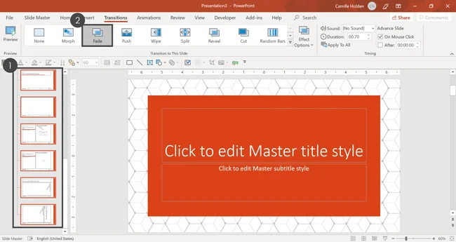
Once that’s done, let’s set the slide transitions. To do that, simply:
- Select all of the slides in your template (in the Slide Master View).
- Click into the Transitions tab in the Ribbon and select your preferred slide transition.
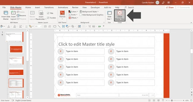
Next, let’s make sure we close the Slide Master View since we are done with it. From the Slide Master tab in the Ribbon, click Close Master View.
Note: There is also a Notes Master and Handout Master in PowerPoint that you can set up and format. These masters determine the look and feel of your PowerPoint handouts when you print them.
B. Stress test your template to make sure it works
It is highly recommended that you test your template before you distribute it. That way you catch any errors before your users do.
Here are some ways you can stress test your template:
- Try to use it in a variety of different ways to see if it breaks
- Type in all kinds of dummy text
- Delete things and turn them back on again
- Paste slides in from other templates to see what happens in your template
Conclusion
And that’s how to create a PowerPoint template that works the way it is supposed to.
You now have the foundational skills to start creating your own PowerPoint templates and building beautiful and tailor-made presentations.
If you want to learn more about building and deploying your template in professional settings, I recommend checking out my step-by-step training course, see details here.
As a quick recap of everything we covered, you learned how to:
- Navigate the Slide Master View,
- Create and insert slide backgrounds, as well as hide background graphics,
- Format each of the elements on the Parent Slide layout,
- Format each Child Layout and create your own custom Child Slide layouts,
- Add and adjust the Guides on your Parent Slide layout,
- And more!
If you enjoyed this in-depth tutorial, you’ll love our PowerPoint training courses and tutorials that you can learn more about here.
About the Author

Camille Holden
Co-Founder, Nuts & Bolts Speed Training
Camille Holden is a PowerPoint expert, a trainer and a presentation designer. After years working in the trenches, fine-tuning hundreds of her colleagues' last minute panic-attack presentations, Camille cultivated her PowerPoint skills through tricks, work-arounds, and fine-tuned techniques for getting more done. When she's not helping clients build gorgeous and functional presentations, you can find her singing jazz or doing yoga.