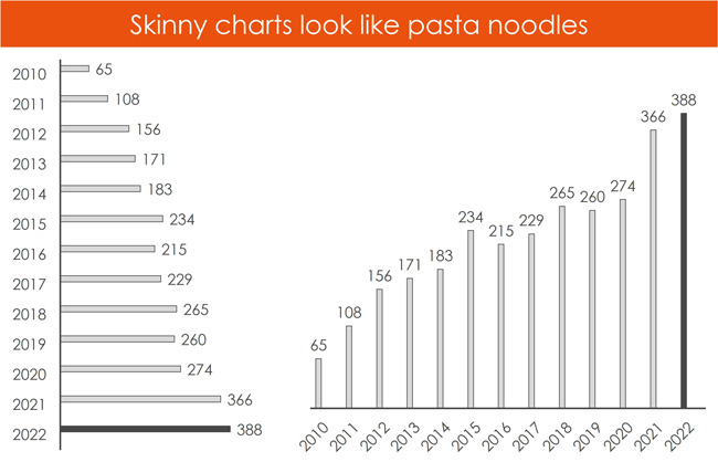
An analyst from HSBC asked me how to quickly fix a skinny bar chart or a skinny column chart that sometimes show up in his decks. As you can see in the picture before, a skinny chart is not only harder to read and looks less professional, on top of that it looks like little pasta noodles.
The last thing you want to do is invest a bunch of time building a bar chart or column chart for your final client deliverable, only to have everyone think it looks bad. Poorly formatted charts often have the opposite effect of what you are looking for. Instead of focusing on the content of your chart, your audience gets sidetracked by the bad formatting.
Well formatted charts enhance the clarity of your message by making complex data more accessible and easier to understand. On top of that, properly formatted (and good-looking) charts are better at capturing your audience’s attention and maintaining their interest.
Your job as an analyst is to develop your PowerPoint eye so that you can quickly find these types of charts in your document and know how to quickly fix them.
[Watch] Skinny Bar Chart and Column Chart Fixes
You are currently viewing a placeholder content from Youtube. To access the actual content, click the button below. Please note that doing so will share data with third-party providers.
More InformationFinding and fixing these types of charting issues is your job as an analyst or an associate. On top of that, you might have to show your colleagues and bosses how to fix these types of charting issues, as not everyone knows how to do this.
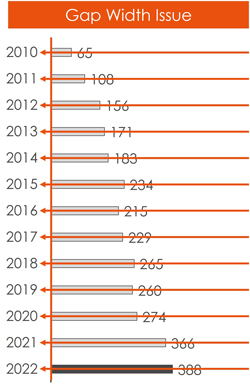
Issue #1. Change the Gap Width of your bar or column chart
When dealing with a skinny chart in PowerPoint or Excel, you can tell you have a gap width issue if your categories align perfectly over the bars or columns within your chart. If they are perfectly centered like in the picture below, you can immediately fix this by changing the gap width.
How to adjust the Gap Width of a chart in PowerPoint or Excel? Follow the steps below.
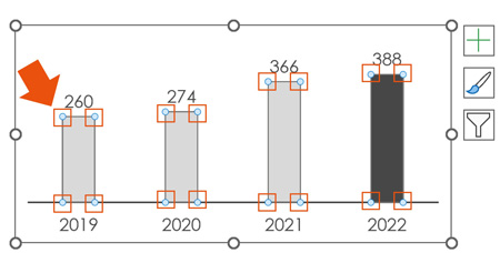
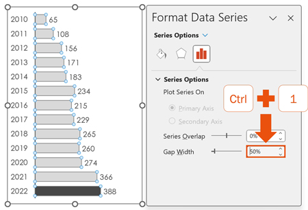
1. Select your bar or column chart series
Within your bar chart or column chart, select one of your data series. You will know you have done this correctly as your bars or columns will have circles around the edges of them as in the picture below.
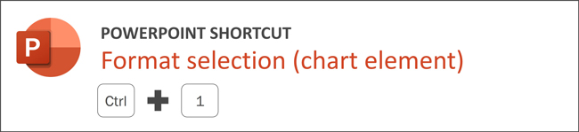
2. Open the Format Series dialog box
With your series selected, hit Ctrl + 1 on your keyboard to open the Format Dialog box.
The fastest way to format any element of a chart in PowerPoint, Word, or Excel is with the Format Selection shortcut, Ctrl + 1 on your keyboard.
Selecting an element of a chart in PowerPoint or Excel and hitting Ctrl + 1 on your keyboard, opens the chart formatting dialog box to the specific options you have for formatting that element. This saves you from having to dig around your Ribbon or having to dig through your dialog boxes to find the formatting options for a specific chart element. I can only think of one specific case – changing a marker style type – that this shortcut does not work for.
To learn more time saving keyboard shortcuts like this for PowerPoint, read our guide here.
If you do not like keyboard shortcuts, you can alternatively double-click a chart element to hopefully open the correct dialog box, or by using the Format Selection command.
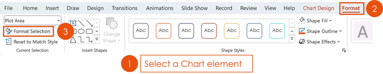
How to use the Format Selection command to format a chart element in PowerPoint or Excel.
- Select the element within your chart that you want to format
- Click the chart Format tab in your Ribbon
- Click Format Selection
Clicking Format Selection opens the chart formatting dialog box to the formatting options for that element in PowerPoint or Excel.
This is a fast way to always get at the correct formatting options, instead of having to dig around the dialog boxes looking for the correct formatting features.
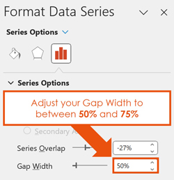
3. Adjust your Gap Width to between 50% and 75%
Inside the Format Series dialog box, change the Gap Width to between 50% and 75%.
In my training seminars for investment banks and consulting companies, most managers and directors prefer a Gap Width of between 50% and 75% because it looks more professional and polished in client deliverables. The Gap Width of your bar charts and column charts is a personal preference, so feel free to use a different percentage if your boss likes skinnier charts. As a general rule though, 50% Gap Width always looks best.
Issue #2. Delete the hidden data from your bar or column chart
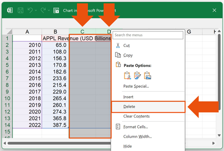
The other cause of skinny bar charts and column charts in PowerPoint and Excel, is hidden data within your chart. You can tell you have hidden data in your chart if your categories do not center or perfectly align with the bars and columns in your chart.
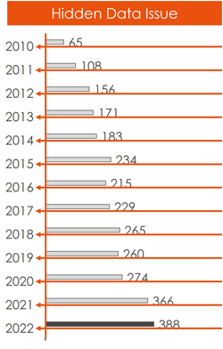
In the picture above, notice the extra spacing in the chart that is pushing the content to the left. That is an indication that you have hidden data in your chart. Once you fix the hidden data issue, you will also typically need to fix the gap width as well.
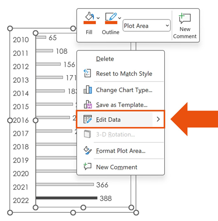
1. Right-Click your chart and select Edit Data
To remove the hidden data from your chart, right-click your chart, and select Edit Data in the right-click menu. This will open the underlying Excel spreadsheet behind your chart that you can then fix.
2. Select the column of blank data and delete them
In the underlying Excel Spreadsheet, select the columns with the hidden data, right-click them and select Delete. It is usually easier to delete the columns of blank information rather than trying to filter them out.
3. Adjust the Chart’s Gap Width (if necessary)
After removing the hidden data from your chart, I recommend double checking your Gap Width too. To do that:
- Select your Data Series
- Hit Ctrl + 1
- Change the Gap Width to 50%
If you have hidden data in your chart, you likely also have a Gap Width issue. That’s because, if someone didn’t know how to remove the hidden data, they likely have no idea how to adjust the gap width either.
Conclusion
Those are two common fixes for skinny bar charts and skinny column charts in Excel and PowerPoint. That is, fixing the Gap Width and/or removing the hidden data from the chart. Making these adjustments will not only make your charts look more professional in your client deliverables and presentations, but they will also make your charts easier to read too.
If you enjoyed this tutorial and want to learn more about our PowerPoint speed Training seminars, training courses, and other free resources, visit us here.