How do you quickly turn your Excel data into visual PowerPoint layouts in minutes, rather than hours? There are two super fast ways to do this:
The first technique we’ll cover is an insanely clever PowerPoint hack (that few know about), and the second is an awesome add-in you can get to do all of the heavy lifting for you.
They both adhere to the Golden Rule of Speed Training:
Never do anything manually in PowerPoint that PowerPoint can automatically.
Whereas most people would insert shapes and copy/paste and/or retype their text, moving from Excel to PowerPoint, we’re going to focus on getting PowerPoint to do the heavy lifting for you, because…
The less manual-mumbo-jumbo you have to do to build your graphic, the more you can get done!
For this PowerPoint tutorial, I’ll focus 100% on creating Gantt Charts or timelines, but the same rules and hacks apply to any other Excel data you might have, BUT…
Let’s first get this out of the way.
Yes…your Gantt Chart data is easy to type up and hold in Excel (what I call listy-Excel).
But it looks 1,000% better when presented properly in PowerPoint (what I call vsual-PowerPoint).
That’s why I advocate taking your Gantt data from Excel and pushing into PowerPoint, AND…
I’ll show you how to do it (see the graphic below) in less than 12 minutes with pure PowerPoint skills, and then how to do it 24x faster (in less than 30 seconds) using an add-in.
And the two main obstacles you need to overcome when moving form listy-Excel to visual-PowerPoint are:
Obstacle #1: Getting started without going crazy
Getting your Excel information in PowerPoint shapes that you can then fully manipulate is a no-starter for most people…
BUT it doesn’t have to be!
What can take most people 10, 20 or even 60 minutes to pull off, I’ll show you how to do in just a few minutes.
Obstacle #2: Updating the data after the fact
This is the classic Excel to PowerPoint challenge. How do you quickly update your information without spending hours re-manipulating your objects or having to start all over again?
That’s where these two clever techniques come into play…
The first is an insanely clever PowerPoint hack (that few know about); and the second is an add-in you can get to do all of the heavy lifting for you.
And even though you will fall in love with the add-in (covered below), the first hack is something EVERY PowerPoint Ninja should know, so don’t skip ahead just yet.
Technique #1: DIY your Gantt chart
This first technique is a PowerPoint hack that every professional should know, as it makes moving between Excel and PowerPoint almost too easy.
This is the fastest way I know of (other than the add-in) to turn lists of data into Excel, into visual layouts in PowerPoint. This is PowerPoint Speed Training at its best!
Visual learners can watch the video below, otherwise skip the video and read on.
For Mac users, you can see the caveats for doing this below. You can also learn more about creating Gantt charts on a Mac here.
Note: This works best for single columns. If you have multiple columns, you will need to repeat these steps multiple times, but don’t worry…it’s fast and fairly painless.
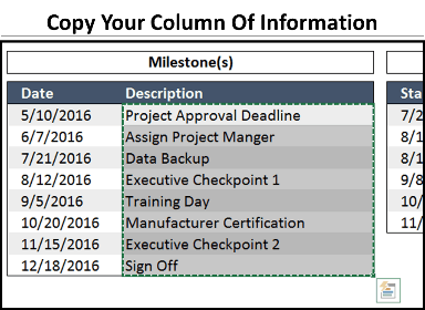
Step #1: Copy the data from your Excel spreadsheet
From PowerPoint, navigate to Excel and select the range of data that you want to turn into individual shapes in PowerPoint.
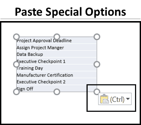
Step #2: Paste your column of data into PowerPoint as text
After copying your information in Excel, hit ALT + TAB to flip back to PowerPoint and hit CTRL + V to paste…
And immediately notice that you have a Paste Special icon in the lower right-hand corner of your pasted object.
To learn other cool Windows 10 shortcuts like Alt + Tab, check out the video below, or see our blog post here.
Note: The icon below only shows up when you first paste something into PowerPoint. If don’t see it, delete the object on your slide and hit CTRL + V again.
Open up the Paste Special dialog box and select the last option, Keep Text Only
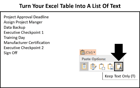
Although it doesn’t look like you have a lot at this point, bear with me…
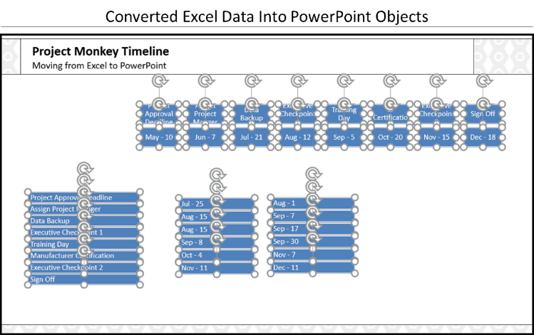
Step #3: Convert your list of text into SmartArt
Select the text box on your slide (so that you have a solid outline around it), navigate to the Home Tab, open up the Convert to SmartArt dropdown and you want to focus on two options here.
This is VERY IMPORTANT.
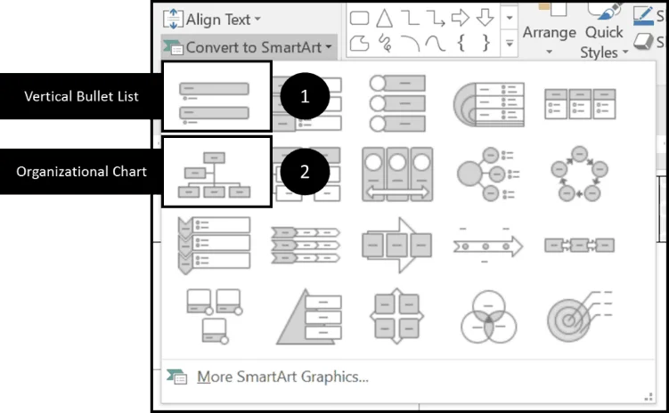
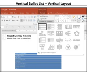
Option #1: The vertical bullet list
Selecting the Vertical Bullet List option turns your graphic into a vertical column of shapes. In this case, the Vertical Bullet List is perfect for the categories and dates beneath our timeline.
Option #2: The organizational chart
Selecting the Organizational Chart turns your list of text into a horizontal column of shapes. In this case, the Organizational Chart is perfect for the horizontal milestones that we will place on top of our timeline.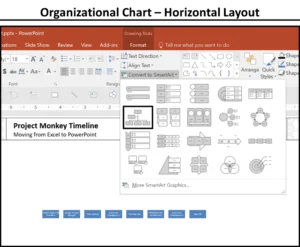
Pick either one of these (I will continue on with the vertical layout).
If you’ve never seen that before, that should already explode your mind…but we are just getting started.
Regardless of which of the two different layouts you use, just make sure you don’t stop here. Next you want to…
Step #4: Pick your SmartArt graphic
Select your SmartArt graphic and hit the ungroup shortcut (CTRL + SHIFT + G) twice.
- CTRL + SHIFT + G the first time breaks the graphic into a group of objects
- CTRL + SHIFT + G a second time breaks the graphic down into individual objects
Doing so gets all of your Excel data into individual rectangles that you can then work with which is much faster than trying to retype it yourself.
Step #5: Repeat for your other columns of Excel data
Repeat the same process for whatever additional columns of Excel data you need to convert to PowerPoint shapes for your Gantt chart graphic.
Again, make sure you choose the correct SmartArt graphic to get your shapes started in the correct position.
Note: For the dates, I used a custom excel data format “mmm – dd” to get the month’s name and the actual date.
Step #6: Rearrange, format, and align your objects
From here, you will need to rearrange, format and align your objects.
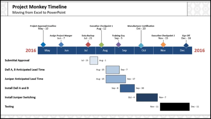
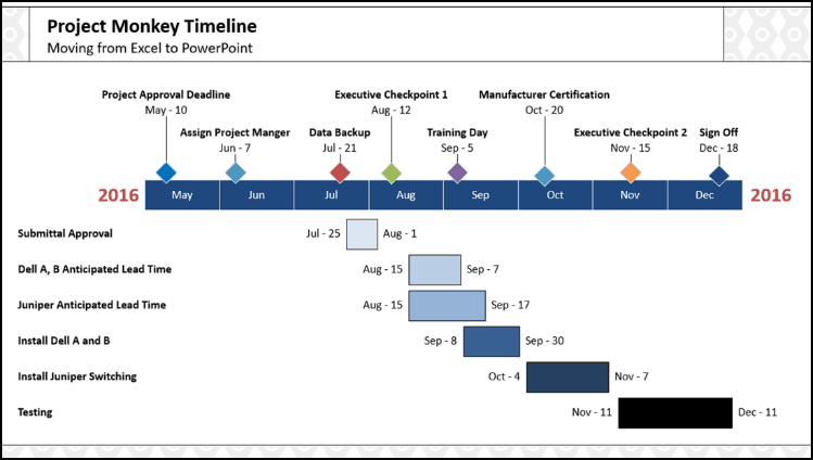 If you are really quick, the layout above should take about 12 minutes to pull off. Don’t believe me? Watch the following video to see the full build-out in real time:
There are 3 major downsides to this technique:
Downside #1: Manually arranging and formatting your objects
Although the SmartArt Ninja trick for turning your Excel data into PowerPoint objects is awesome, you still need to manually update, format and align your objects.
How long it takes you depends on how much speed training you’ve had.
Downside #2: The timeline is not 100% exact
Let’s face it, if you are manually moving things around in PowerPoint for a timeline, things will not be 100% exact.
In the graphic above, I guesstimated where the dates start and stop…I didn’t not figure out the exact place where Sept-8 should line up with the Sept rectangle, for example. In this case I think it’s fine, but if you want 100% precision, you want the add-in I’m about to show you next.
Downside #3: Updating the Gantt chart
As the graphic is manually built by you, updating your Gantt Chart requires you to do it manually. There is no way to dynamically link the Gantt Chart up with your Excel spreadsheet.
On the flip side, there is an add-in that will do ALL of this heavy lifting for you.
Technique #2: The Office Timeline add-in
Now let’s look at the big guns for building Gantt Charts quickly – the Office Timeline+ add-in.
If you build lots of project charts and timelines like this, you simply need to get the Office Timeline+ add-in which does ALL of the heavy lifting for you including:
- Building the entire graphic for you
- Allowing you to quickly change elements within the graphic
- Allowing you to quickly update the data sets
- Building the time sequence for you and keeping it all exact (and I mean PERFECTLY exact)
Visual learners can watch the video below, otherwise skip the video and read on.
If you have a lot of Gantt charts to create and manage, you’re going to want the Office Timeline+ add-in as it will not only make building the original Gantt chart easier…
But will also allow you to dynamically update the Gantt chart after the fact, which is super cool!
You can download a free version of Office Timeline add-in here, just note that to paste from Excel to PowerPoint, as I show you below, you will need the paid version.
That said, we think this add-in does SO MUCH, that the price is a big time steal!
Step #1: Start a new Office Timeline+ graphic
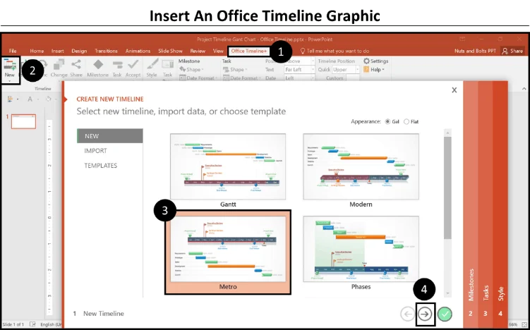
Select the Office Timeline+ tab in your Ribbon (1). Then, select New, in the upper left-hand corner (2).
Next, select your graphic style, I’ve selected the Metro style here (3). And finally, select the arrow to advance to the Milestones tab (yes, it’s that easy!) (4).
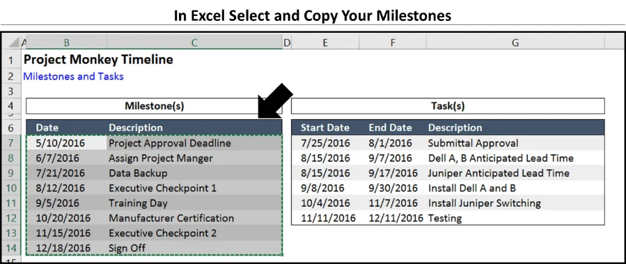
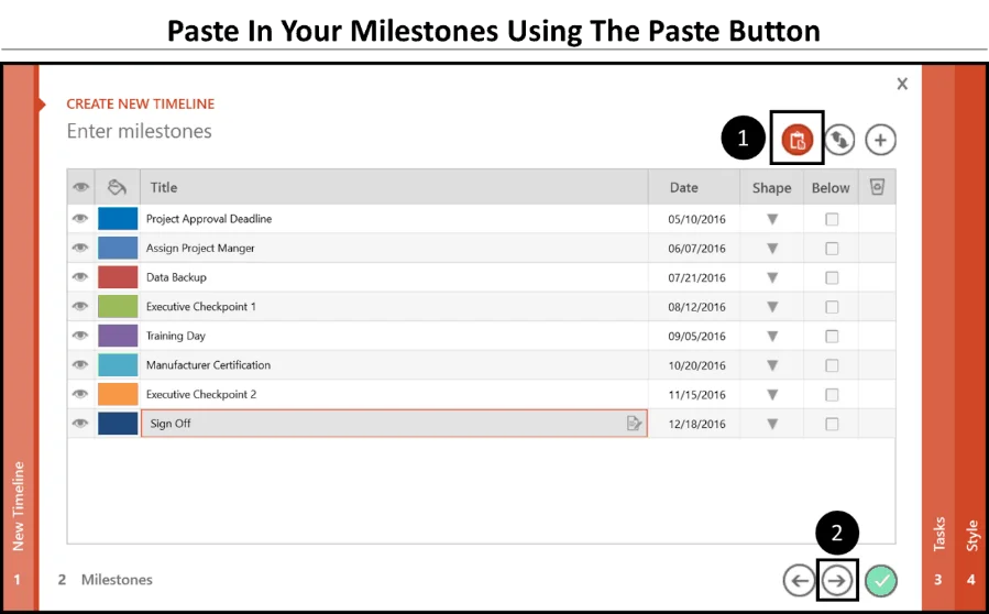
Step #2: Copy and paste your milestones
Hit ALT + TAB to toggle to Excel (if you already have it open). In your Excel sheet select your milestones (make sure to include the dates as well) and hit CTRL + C to copy them.
Now ALT + TAB back to PowerPoint, and in the Milestones window, paste in your milestones using the paste Icon (1)
To see the ALT + TAB shortcut in action, see Top Windows 10 Shortcut #5 below.
Note: Use the icon as shown below, don’t just CTRL + V to paste them in…it won’t work.After pasting, click on the right arrow to navigate to the Tasks tab (2).
Step #3: Copy and paste your tasks into the wizard
Hit ALT + TAB to go back to Excel and copy your tasks, making sure to include the dates.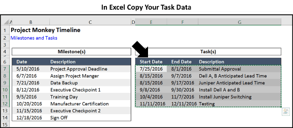
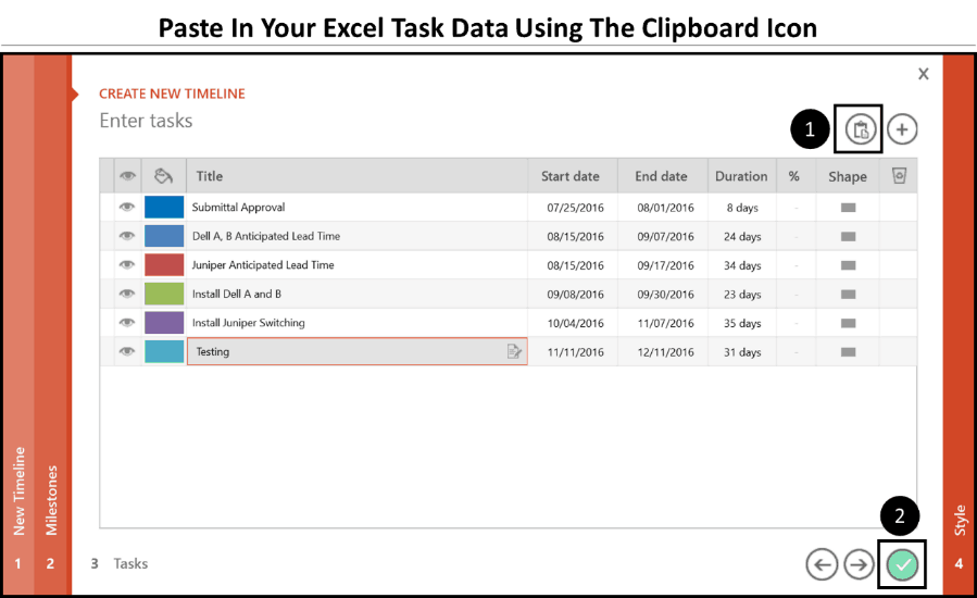
Once more, hit ALT + TAB to jump back to PowerPoint and using the paste icon up in the upper right-rand corner, paste in your task data (1).
Now click the check-mark to finish (2).
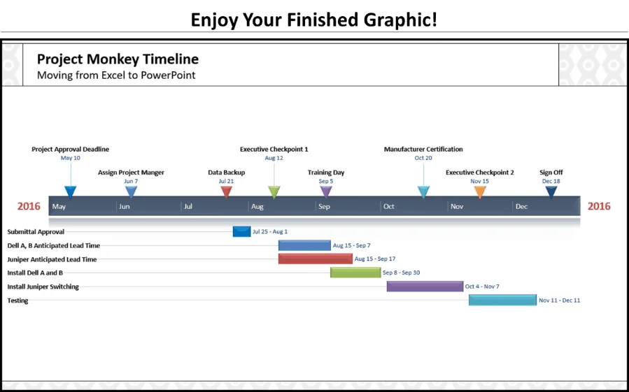
Step #4: Appreciate your chart!
Holy smokes, this chart was created in less than 30 seconds! That is the fastest way to make a Gantt chart in PowerPoint that I know of.
The add-in will insert a new slide (it’s a special Office Timeline+ slide that helps run the graphic), so you’ll need to add your Title and/or Subtitle back, but that’s a small price to pay for all of the time savings.
Step #5: Format your graphic
At this point there is a TON you can do to format and customize your graphics. To see my 5 favorite formatting features of Office Timeline+, including how to turn your graphic into a table, check out the 5 Favorite Office Timeline+ Tricks blog post.
Next steps for your Gantt Chart or timeline
Before we get to formatting the graphic, let’s look at what we have accomplished.
Instead of manually adding shapes to your PowerPoint slide and copying/pasting or retyping your text, which violates our Golden Rule of Speed Training:
Never Do Anything Manually That PowerPoint Can Automatically Do For You
Instead we looked at:
- How to turn your Excel data into PowerPoint shapes using and breaking SmartArt graphics. Remember, you can stack your data both vertically and horizontally.
- How to use the Office Timeline+ add-in to crank out Gantt charts and timelines 24 times faster than you could on your own.
And the truth is that, using the Office Timeline+ add-in…
The fun has just begun!
Once your information is within the graphic, there is a TON of formatting the graphic can AUTOMATICALLY do for you, all of which I cover in the following post.
What’s Next?
About the Author

Taylor Croonquist
Co-Founder, Nuts & Bolts Speed Training
Taylor Croonquist is a PowerPoint expert and trainer. Over a career spanning the globe, from consulting in New York and investment banking in China, Taylor has truly seen it all in PowerPoint. Through necessity and a natural tech savvy, Taylor honed his PowerPoint skills to the point of even blowing the minds of the Microsoft PowerPoint programming team. When he's not busy crafting PowerPoint training, you can find him reading a sci-fi series or scuba diving.