Data visualization is a BIG buzz word these days, but what does it actually mean and more importantly… what does it mean for your presentations?
Well the reason that it’s important is that we live in the age of ‘big data.’ Data these days is at the heart of almost every single business decision.
At a basic level, data is just information — facts, figures, words, percentages, measurements, and observations, but it’s just computerized information.
In order for you to make it useful, you need to find creative ways to make it user friendly for your audience. This is where the art of data visualization comes in!
In this post you’ll not only learn why data visualizations are critical to your effectiveness as a presenter, you’ll discover tips and tricks for visualizing your data to improve the overall effectiveness of your presentations. As you will see, you don’t have to have a complicated data visualization to effectively get your point across. But first off…
What is data visualization?
Data visualization is the secret art of turning data into visual graphics that people can understand (graphs, charts, info graphics, etc.).
And the reason why it is so important is it allows the human eye to see trends and patterns that it otherwise can’t see or make out. Words may be mightier than the sword, but in a battle for our brains, visual images win every time. Colin Ware, author of “Information Visualization: Perception for Design” states, “The eye and the visual cortex of the brain form a massively parallel processor that provides the highest-bandwidth channel into human cognitive centers.” Here are a few additional statistics highlighting the importance of data visualization over text when presenting information:
90% of the information transmitted to the brain is visual
Humans process images 60,000 times faster than text
70% of our sensory receptors are in our eyes
65% of people are visual learners
In short, visual data is easier to remember than words. Studies have also shown that while only 10-20% of written or spoken data is remembered, 65% of information is remembered when it’s presented visually. That’s why it’s important to present your most important data visually. It ensures your information is processed faster, more easily understood and remembered.
Why is data visualization important?
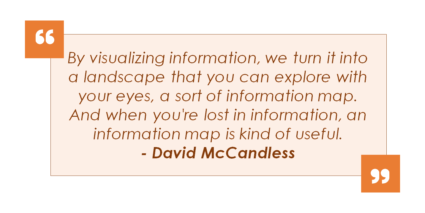
As previously mentioned, we are living in the age of ‘big data’, in fact we’re drowning in it! As David McCandless, author, data journalist and information designer, stated in his Ted Talk (see video below):
To see David’s full Ted Talk, click play below:
Data visualization is your map to understanding information and gives you clear directions on where to go next. On top of that, when done properly, data visualization has 5 additional benefits: 1. Amplifies your message Your message is amplified in a few different ways. First of all, by taking the time to create data visualizations, you show your audience that you’ve done your homework. That alone gives a sense of credibility to your content. Without visualizations, you run the risk of your audience not understanding what you are trying to present. Your data might even be received as meaningless and your entire message lost.
2. Gives meaning to your data
Visualizations communicate valuable insights by creating visual representations of your data. For example, an Excel spreadsheet showing that Microsoft’s sales revenue has almost doubled between 2011 and 2018 isn’t nearly as effective as graphing that data in a simple column with some formatting.
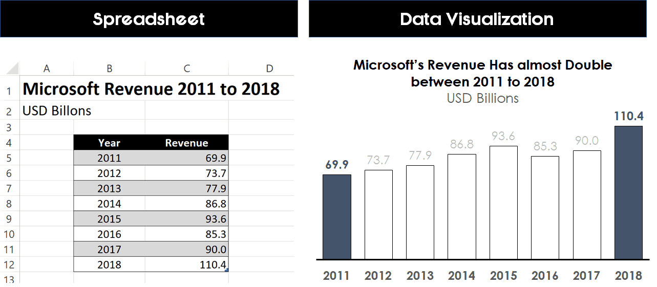
And notice how much easier it is to visualize that change in revenue in the picture above on the right. This also gets into the importance of highlighting your point visually in your data visualizations, which you can learn more about in the video below.
3. Saves time
Instead of spending the time trying to figure out what the facts and figures mean, your audience members can ENGAGE with the meaning. A visual representation allows you to analyze huge amounts of info in the blink of an eye. As we know, the human eye can recognize and process visual information much faster than text.
4. Makes for better decision making
Assuming your data visualizations contain correct data and are done properly, you’ll not only be able to make decisions faster, but they will be based on data that you fully comprehend.
5. Is more shareable and digestible
One of the best things about data visualization is that they are accessible and easier to share across departments, with colleagues, your boss, or with a large audience. They can be inserted in your PowerPoint presentation, printed for seminar handouts, or even posted and shared on social media.
For example, below is a data visualization superimposing the Titanic over the world’s new cruise ship (the Allure of the Seas) to demonstrate that the new ship is almost 5 times bigger.

Data Visualization Examples
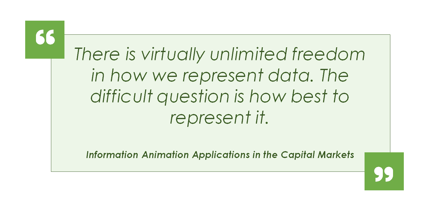
As stated in the research report “Information Animation Applications in the Capital Markets”
The impact of your visual data is only as good as the visualization! Here are a few great examples of successful data visualizations to give you an idea of the best way to deliver complex information through visuals:
http://www.visualinformation.info/visualizing-the-national-debt-infographic/
It’s important to choose the right visualization for the right information. Here are some of the most common data visualization techniques:
Column Chart Example
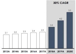
Bar charts are one of the most popular data visualizations and most commonly used for comparing items over a horizontal time frame, moving left to right.
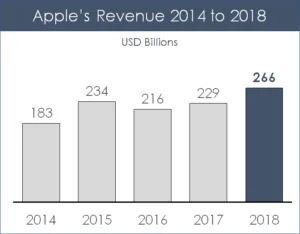
These specific data visualizations usually work best with less than 15 data points. If you have more than 15 data points, I recommend using a line chart instead.
You will see this type of data frequently used for showing sales figures over a specific time period, with the years running along the x-axis and the unit running along the Y axis, as you can see in the example below showing Apple’s Revenue from 2014 to 2018.
If your chart data lives in Excel and needs to stay updated, you can also link your Excel chart to PowerPoint.
Bar Chart Example
Similar to the bar chart, the column chart is used to compare multiple values outside of a horizontal based time frame.
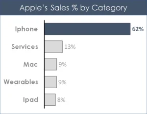
This works well for survey data, responses or any other non-date based category. For this type of data visualization you will see the category running up and down
You can also use two different column charts to show how a category has changed over a specific time period.
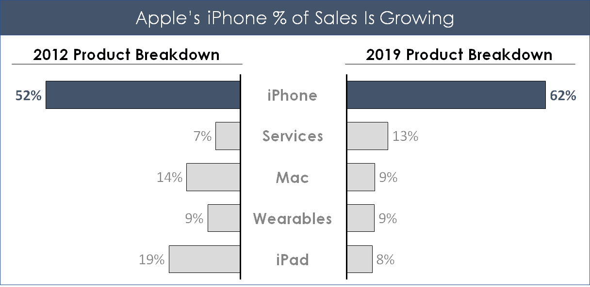
The two-sided bar chart is a great way to show changes in specific categories over two specific time periods, without having to show all of the information in between those two dates.
Pie Chart and Doughnut Chart Examples
Another familiar visualization technique is the humble doughnut chart (one step better than a pie chart).
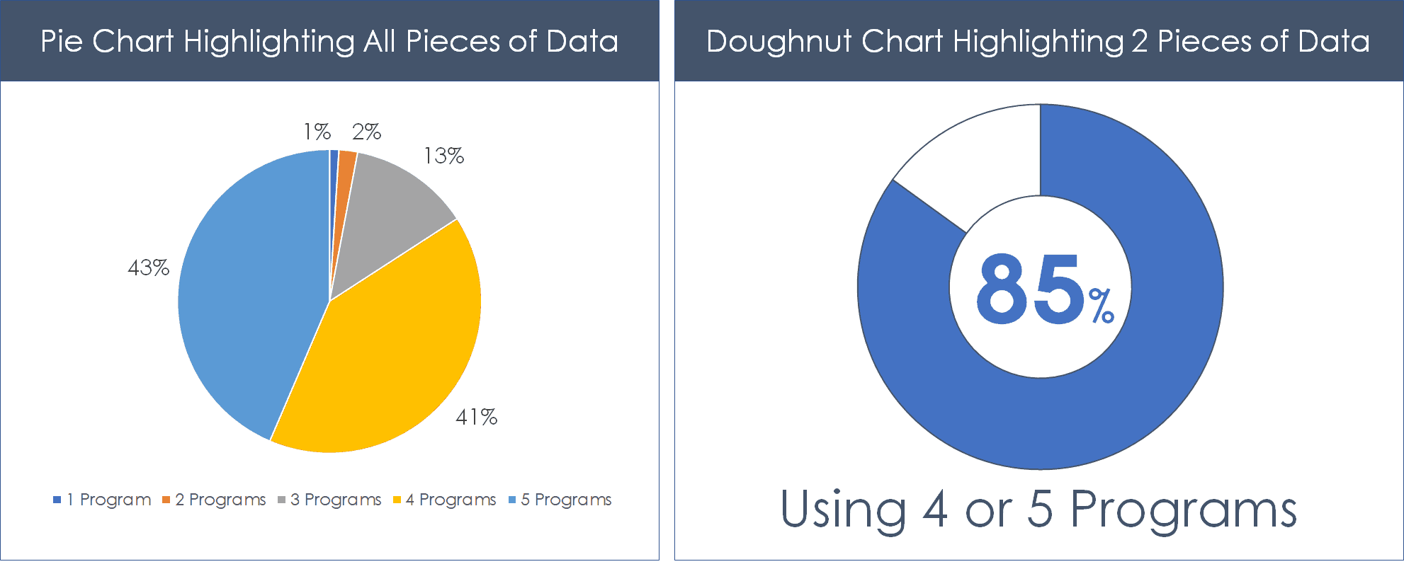
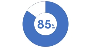
The key to making your doughnut charts or pie charts clearer, is to break down your data into two pieces of data to highlight the point you want to make.
For example, if your point is that 85% of survey respondents are using 4 or 5 programs, combine those pieces together and highlight it against the other data as contrasted in the visual below.
Timeline Example
A timeline is a great data visualization technique when you wish to show data in a chronological order and highlighting those important points in time.
To create a Timeline, simply layout your data points along a PowerPoint shape, and mark the data off to visually see your overall project.

If you need to create lots of time based timelines like this, I recommend checking out Office Timeline. Their PowerPoint app makes creating timelines and Gantt charts extremely easy.
Venn Diagram Example
The Venn Diagram is a great technique for comparing and contrasting ideas and concepts, especially when showing an overlapping piece is important.
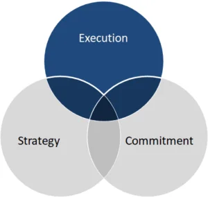
For example, in the simple Venn diagram below, your point could be that for a successful launch, you need strategy, execution and commitment.
For help making a Venn diagram in PowerPoint, read our guide here.
Gantt Chart Example
Gantt Charts are particularly useful for project managers as a visualisation technique to show when different phases of a project are starting and stopping over a specific timeline.
Below is an example of a Gantt chart (with a timeline) built entirely using PowerPoint shapes.
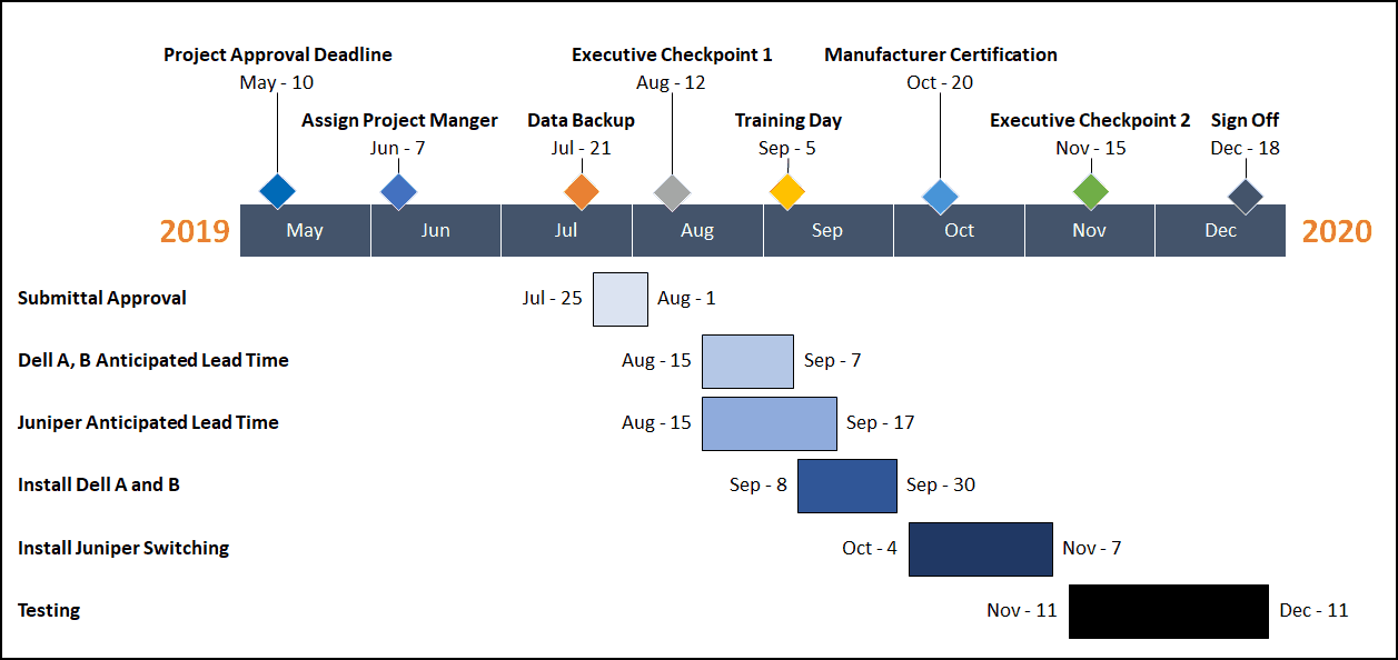
Gantt charts like this allow you to organize tasks, team members, timing, potential problems, etc.?
They can also be useful for showing multiple categories of continuous data over a period of time.
Infographic Example
Infographics are the business buzzword of the moment. Infographics are a great way to deliver facts and figures in a narrative format which is both attractive and easy to read. They are particularly useful to explain case studies or to summarize complex reports.
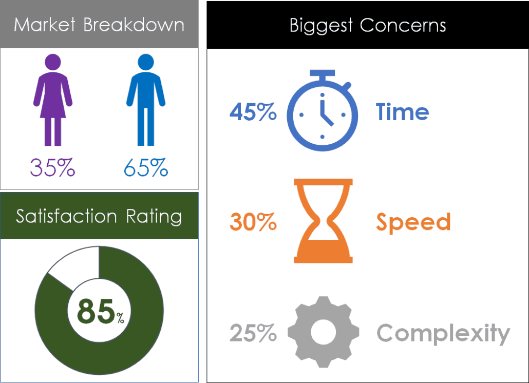
You can create your own infographic using PowerPoint icons, graphics, charts, and creatively formatted numbers.
Below is an example of a simple infographic I created in Microsoft PowerPoint using nothing but the default PowerPoint icons, fonts and charts. You can obviously make them more complicated if you like.
The goal of an infographic like this is to break down your data points into something visual so that users can more easily digest the information you are presenting them.
Dashboard Data Visualization Example
A dashboard is a data visualization that brings multiple pieces of data (charts, graphics, etc.) onto a single slide. That way you can show the overall health of a situation instead of just individual pieces. Or as explained by "Smart Data Collective’s Keyan Keihani."
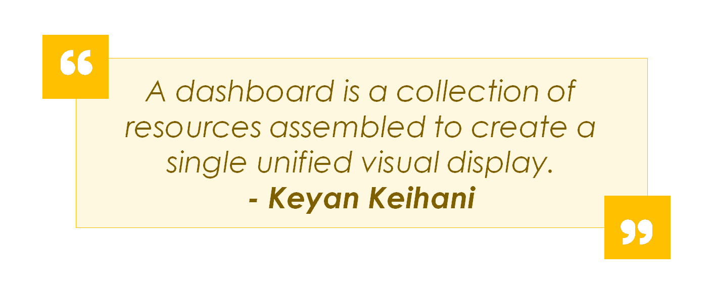
To create a dashboard, simply create individual graphics of the relevant data points you need to see the overall health or performance of your topic.
For example, your dashboard could be as simple as 3 column charts showing annual sales, annual expenses and annual net income as shown below.
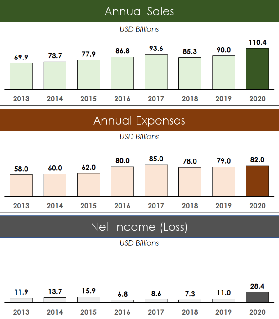
To keep the above dashboard consistent, I used the same vertical axis value of 130 billion. That way the data stays consistent across all 3 column charts. I also used a darker color to highlight the year 2020.
Data Visualization Tips
Don’t forget to be specific in your titles
While data visualization helps your audience understand your data more easily, you’ll still want to label it well. If you don’t properly label your graphics, your entire meaning can be lost.
Give your graph or chart a title and it instantly becomes more readable.
Highlight your main points clearly
Highlighting certain figures, sections or columns helps draw attention to the most essential information and can direct your message.
For example, if your bar chart shows high sales figures and low sale figures, depending on the focus of your presentation, you’ll want to highlight different aspects of your data visualization. To highlight points on your visualizations you can:
Add rectangles or arrows to emphasize your main points
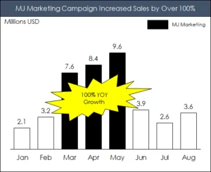
Add a ‘call out’ to highlight your main point
In the below example I used the Explosion: 14 Point PowerPoint shape to highlight the 100% year-on-year growth.
Use colors to highlight your main points
In the below example I’ve used darker shape fills to highlight the years 2011 and 2018 data. For this specific example, I’m highlighting the growth between these two dates to make a point.
Simplify Your Pie Charts
Pie charts aren’t our favorite data visualization, but when you do have to use them there are a couple of tips to help you.
Rule of 2s
Format your pie chart to just 2 pieces of data to direct focus and make the most important information stand out and easier to understand.
Conclusion
When presenting complex information, the right data visualizations are critical to the success of your presentation.
The best data in the world won’t save you unless you present it in a way that people can understand.
So the next time you plan on presenting complex information, it’s worth taking the time to create the right visualization.
About the Author

Taylor Croonquist
Co-Founder, Nuts & Bolts Speed Training
Taylor Croonquist is a PowerPoint expert and trainer. Over a career spanning the globe, from consulting in New York and investment banking in China, Taylor has truly seen it all in PowerPoint. Through necessity and a natural tech savvy, Taylor honed his PowerPoint skills to the point of even blowing the minds of the Microsoft PowerPoint programming team. When he's not busy crafting PowerPoint training, you can find him reading a sci-fi series or scuba diving.