Are you trying to create the perfect presentation? You know, one that successfully grabs your audience’s attention through great content and design? And you don’t have the time to go and read a dozen books on messaging, design and storyboarding?
Luckily for you, it’s possible to make effective presentations in less time, and stand above the league. I’ve figured out how to streamline my presentation build up process into 5 steps. Here’s how I do it, and here’s how you can too:
1. Know your audience
Before the design comes the content and before the content comes the audience. You must make a presentation with your audience in mind.
Defining their needs is the key to surpassing their expectations. [Who, why, what, how] is the perfect formula to assess your audience characteristics and give them what they want.
Here’s a template you can use to quickly assess your audience’s characteristics:
Who are they?
Employees, investors, partners, CEO, consultants, customers
Why are they here (and why should they care)?
What do they think they’re going to get out of this presentation? What do they want to learn? What issue/challenge/insight will you address in your presentation?
What do they need/want?
What do they think they’re going to get out of this presentation? What do they want to learn? What issue/challenge/insight will you address in your presentation?
What do I want they to do?
Be informed, make a high-stake decision, or buy something?
How much do they already know about the subject/issue?
Are they beginners, advanced? How do they perceive you? Their hero, mentor, partner, consultant, or just another sales guy trying to pitch a new boring product? Do you need to convince them of something?
How can I help them/solve their problem?
Slide design tip #2: Structure your presentation
Now that you know who you’re talking to, you need to structure your presentation to effectively reach these people. Here’s how to do it, in a way that will make the presentation creation process smoother:
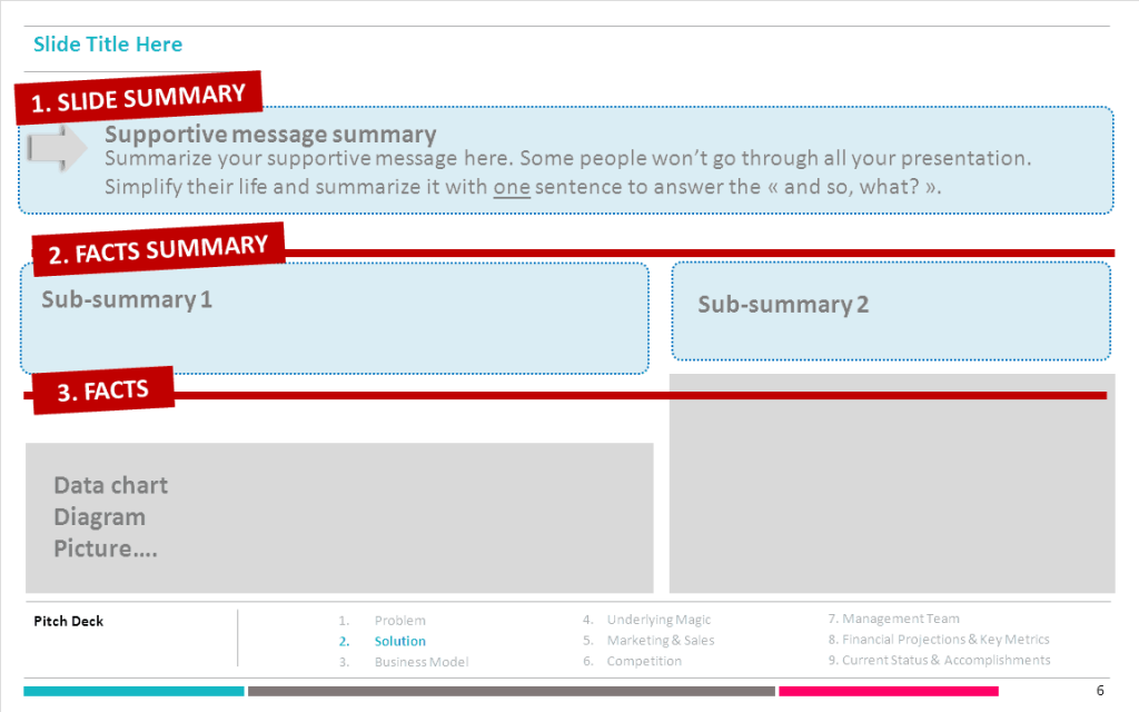
A. Create an outline and define your core message.
What message do you want to convey to your audience? Think of this part as your “theme”. You must suggest to your audience where you are going to take them. Then, assemble an outline:
- Introduction – sweet and easy, what is it all about and why should they care?
- Body – core message+ supportive message + evidence backup
- Conclusion – final wrap-up, must answer the “so what
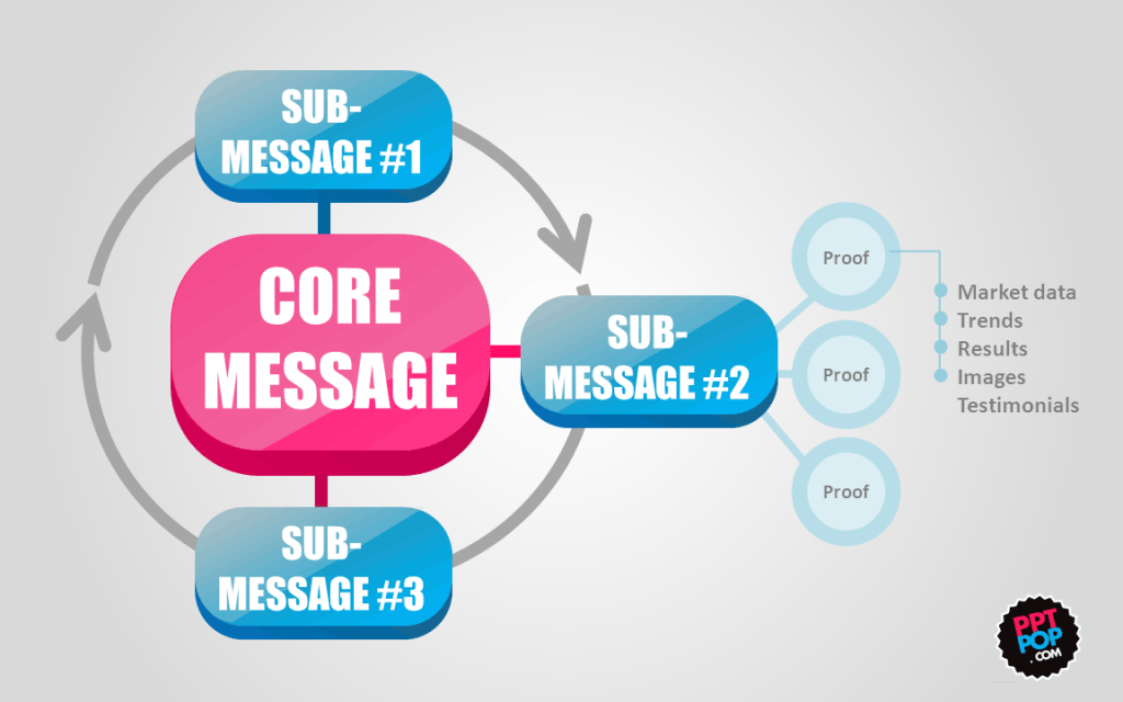
B. Give your core message a logical structure.
What sub-messages do you need to convey to your audience to support your core message? Ideally, each slide must have one supporting message. These sub-messages strengthen your core message and must be backed up by pieces of evidence (facts, data…).
C. Assemble your message components.
Your core message needs authority proofs to establish your credibility. Opinions are great, but facts are better. Use data to amplify and clarify your message points.
For instance:
3. Keep it simple
You know exactly what message you want to convey to your audience. And you’ve outlined a knockout presentation structure on the basis of supportive messages. Great.
You now need to simplify your message to make it easier to swallow. In PPTPOP’s introduction to great presentation design, I explained that sticky ideas have 6 success principles, and that simplicity is the core of them.
And that’s the tricky part because the concept of simplicity is often misunderstood. Many professionals are terrified of the word “simple” because they are scared of being labeled lightweights, lazy, or ignorant. They mistakenly link quantity with quality and will tell you “when in doubt, add more”. Ignore that advice and get this as part of your D.N.A:
Simple doesn’t mean simplistic, it means finding the core of your idea and stripping it down to its most critical essence.
Overcrowding a slide doesn’t make your message clearer. Here are the rules I follow to simplify my message:
One slide = one supportive message
One supportive message = one sentence

Summing up your message in a one sentence is hard, I won’t lie to you. But it’s a great exercise that will force you to prioritize and focus on what really matters.
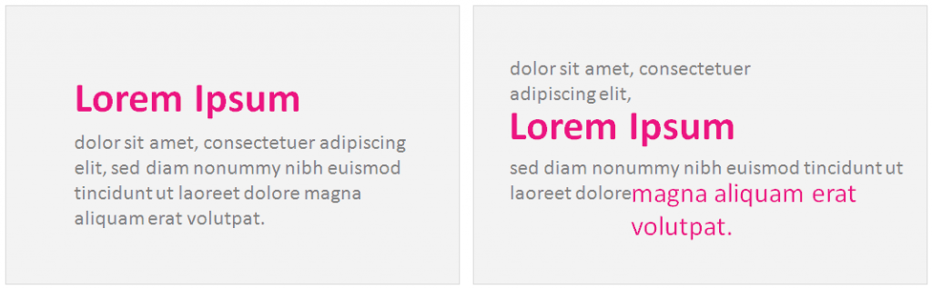
Each slide must answer to “so what”. You’ve displayed data, charts or fancy diagrams on your slide? Simplify your audience’s life by synthesizing the data in one sentence. The audience must understand the core point of your slide just by reading your title.
To provide your audience with strong messages, make your slide titles headlines, not descriptions.
“2013 Cashflow” is a description.
”2013 Cashflow Grew 36%” is a headline.
4. Arrange slide elements
How slides are arranged have a big impact on whether your core and supportive messages are visually clear to your audience. Your slide arrangement tells a story. And guess what, if the arrangement is messy, your story will be too. Here are a few simple things you need to focus on to maximize the clarity of your slides:
Contrast – So your audience can instantly identify the main points. Contrast comes with the size and colors used.
Flow and Hierarchy – So that your audience knows in which order to process the information.
5. Be Consistent
a) Color Set – PowerPoint presentations are not birthday cakes, don’t overload them with tons of colors. Instead, pick 2 or 3 colors, for your content slides. These colors must stand out and have enough contrast with your PowerPoint background.
You can use ADOBE COLOR (formerly Adobe Kuler) to assess which colors go well together. Highlight key figures and data with colors. I’ve released a video tutorial to help presenters understand how to use Adobe Color, you can check it out here.
b) Font – Fonts can just make or break your presentations, so you’d better select yours wisely. I recommend you choose ONE font for all your content slides, and maybe use ONE additional one for your headlines (your slide titles).

c) Quality Photography – Don’t use cheesy images that make our blood boil each single time we see them. Instead, chose quality photo that arouses feelings and emotions. You can check out my favorite free photography sources here.
Slide Design Tip Closing Thoughts
Crappy presentations often look homogeneous, filled with endless text and cheesy images that just fail to captivate audiences. Great presentations merge compelling content with visual appeal, and succeed at grabbing audiences’ attention.
To produce compelling content, you need to put yourself in your audience’s shoes, identity who they are and what they want, while crafting a message that will be easily processed.
As for the design, just be consistent. Grab a color scheme, modern fonts, relevant photography and stick to it from the beginning to the end.
By activating the 5 steps you’ve just walked through, you’ll be able to craft better slide decks faster, and provide your audiences with consistent content that will make you stand out above the rest.
To see more helpful PowerPoint tutorials and resources, visit us here.